Vosges Haut-Chocolat had the heritage, the product quality, and the loyal customer base. What it didn't have was a creative foundation — no visual system, no asset library, no consistent look and feel across channels.
As sole CD, I owned everything: brand strategy, photography direction, campaigns, web, social, email, partnerships, and product launches — across the most important selling season of the year.
The unique thing about this engagement was the scope of the creative opportunity — we weren't just building campaigns to support existing products. We were creating the products and packaging themselves, often limited edition, and then concepting and producing the full campaign to support them. Truly beginning to end: from the product idea, to the package design, to the shoot, to the campaign assets deployed across every channel.
I built and directed three distinct visual looks for the holiday season — advent, collection drop, and evergreen lifestyle — then led a product launch that came together entirely on set, and directed a partnership collab that became one of the brand's most talked-about moments. All of it built as a modular, reusable asset system.
Channels covered: product dev, packaging, strategy, media, paid social, organic social, web, email, OOH, influencer, packaging, retail, events.
Existing Hero Logo (On-Pack)
Added to over time, this ornate mark looked luxurious and ownable printed in foil on packaging.
Existing Wordmark
More corporate solution for compact spaces.
But lacks brand equity and flair.

New Logo Evolution for Digital
The wordmark alone wasn't working in social/digital — too disconnected from the brand. The solution was a paired-back version of the pack logo — refined, but maintaining the handcrafted feeling. A quick read for a fast format when pictured together with mouthwatering photography.
Storytelling
This brand had an abundance of story to tell — which is not a bad thing. We just needed to distill the messaging in a way that it would resonate with those like-minded consumers. Each piece of communication can't say everything or it will say nothing at all, no matter the craft behind it.
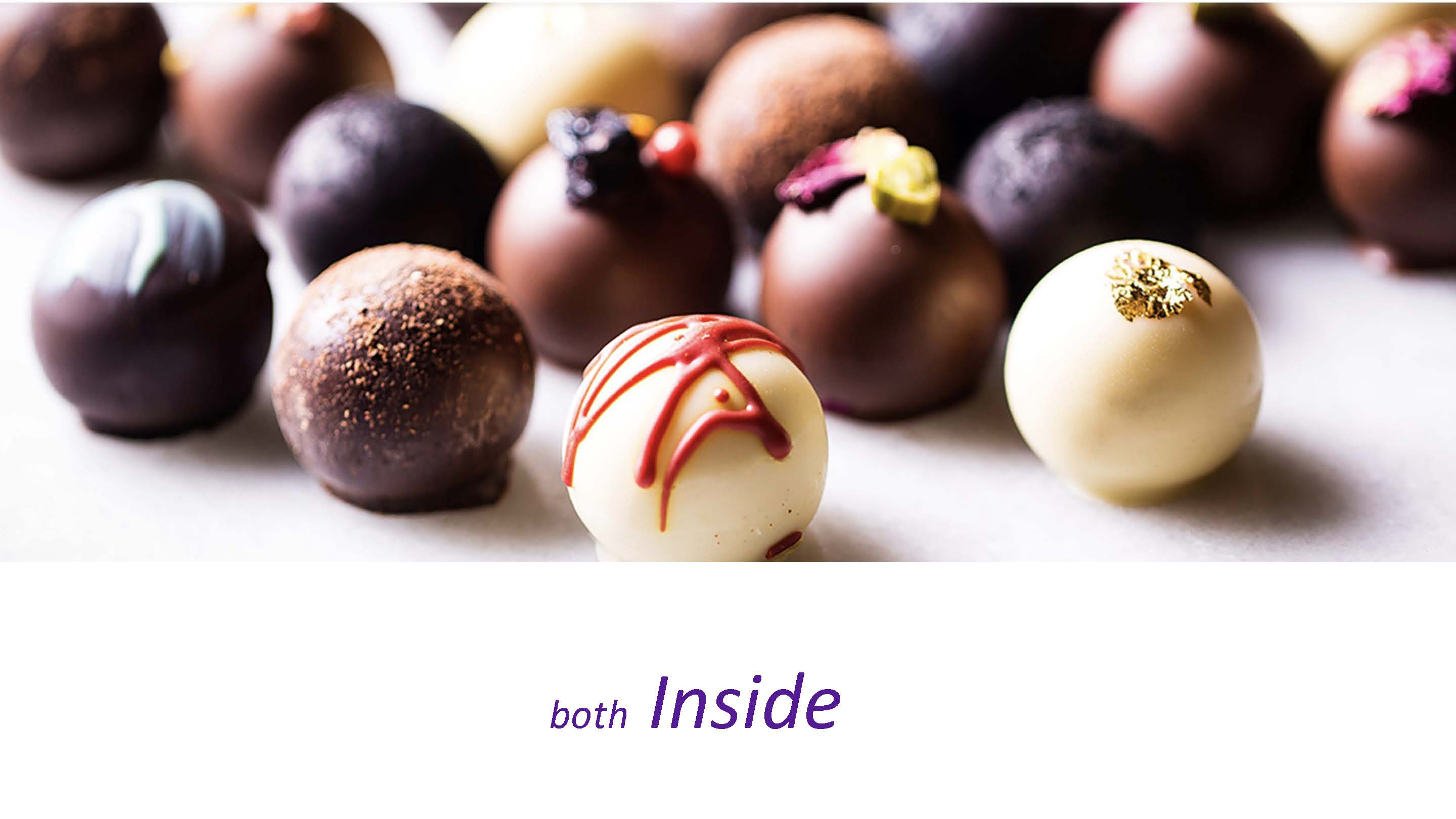
In order to let that true Vosges heritage shine, everything needed to go through the filter of: Vosges is an artisanal chocolate brand rooted in artistry, craft and experience — which comes to life both INSIDE the box through the chocolate recipes themselves, and OUTSIDE the box with the art it is wrapped in.

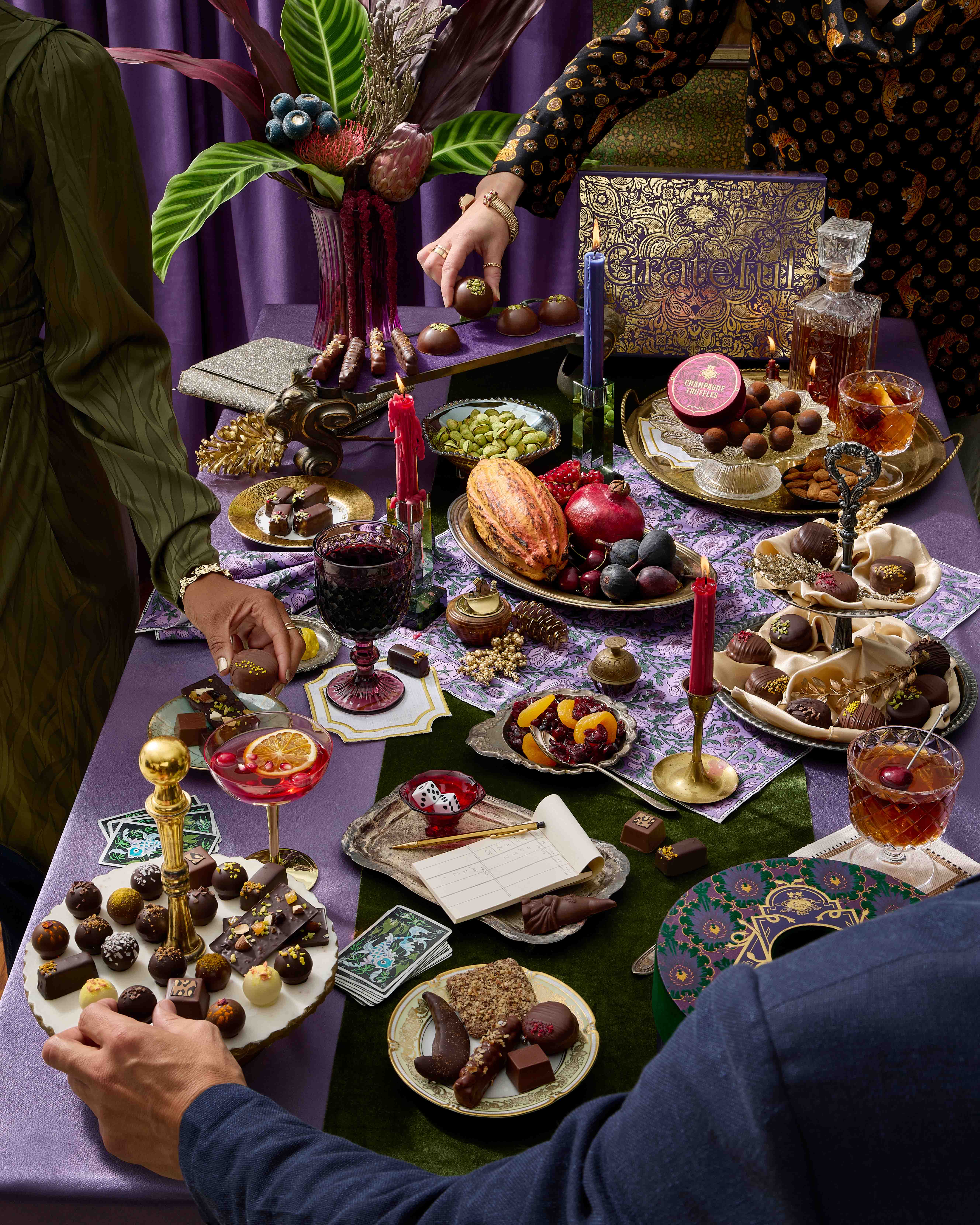
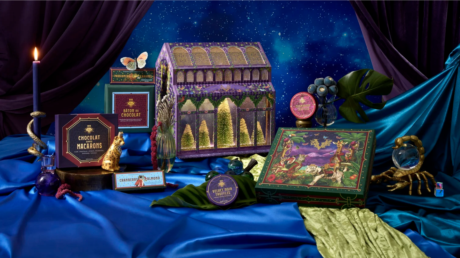
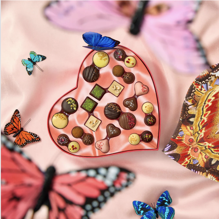
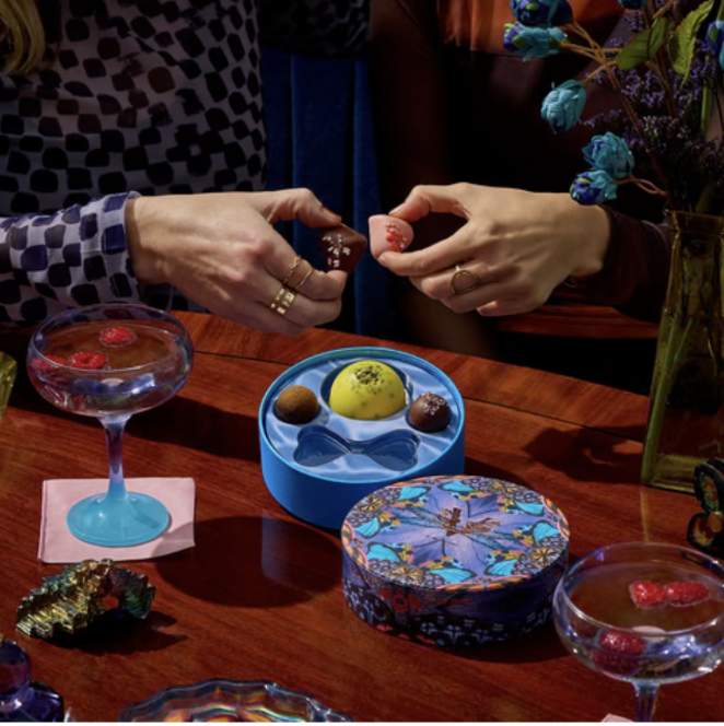
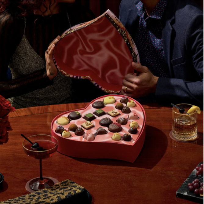
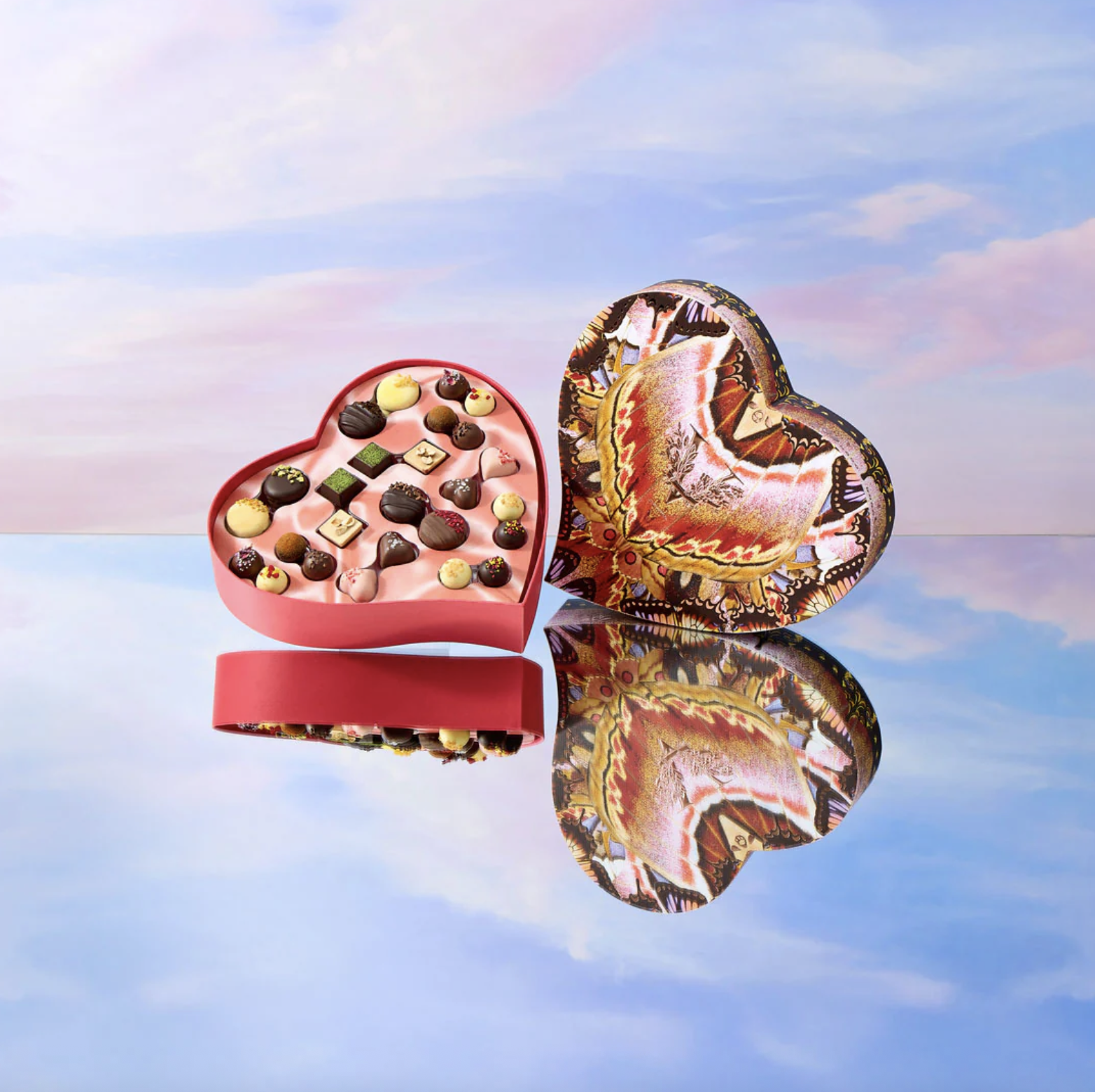
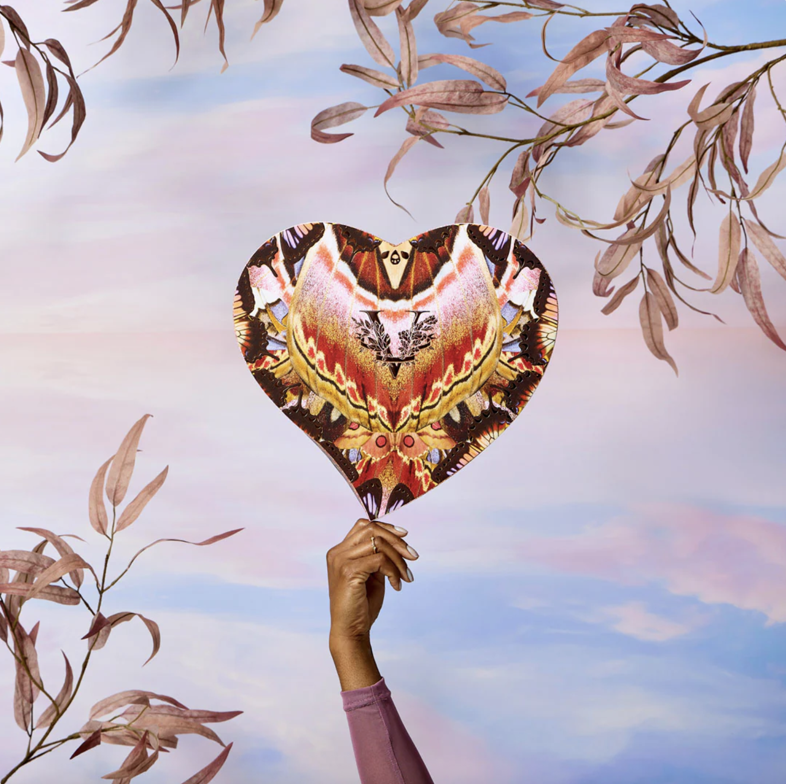
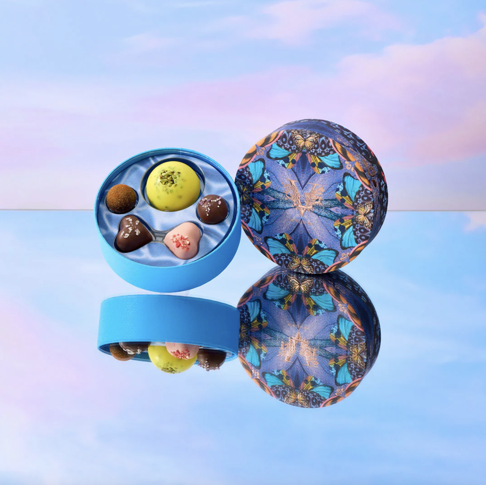
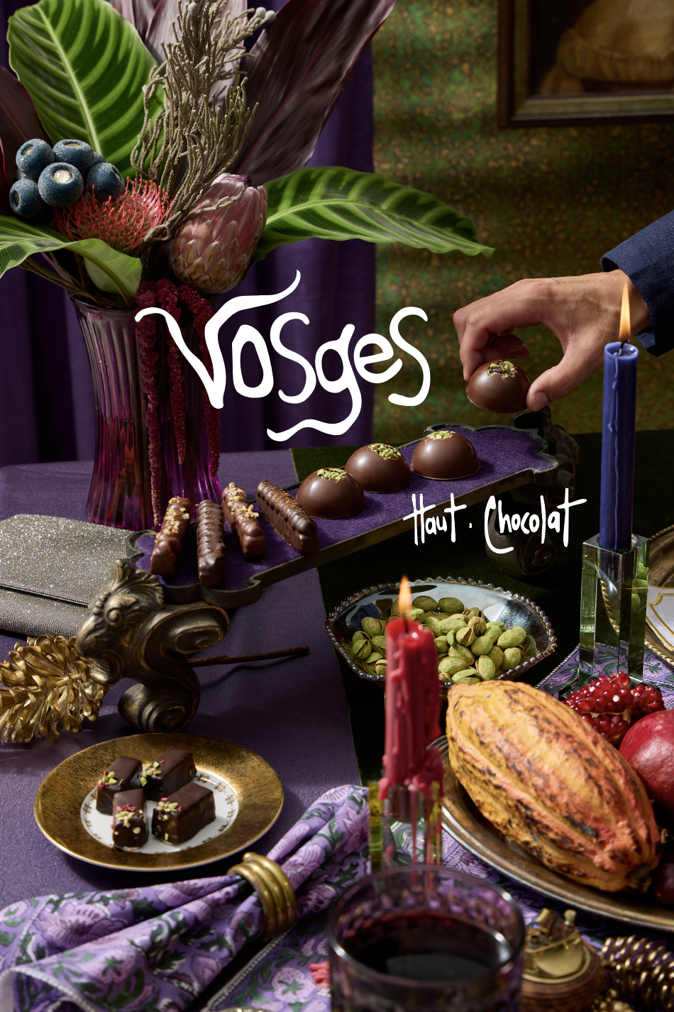
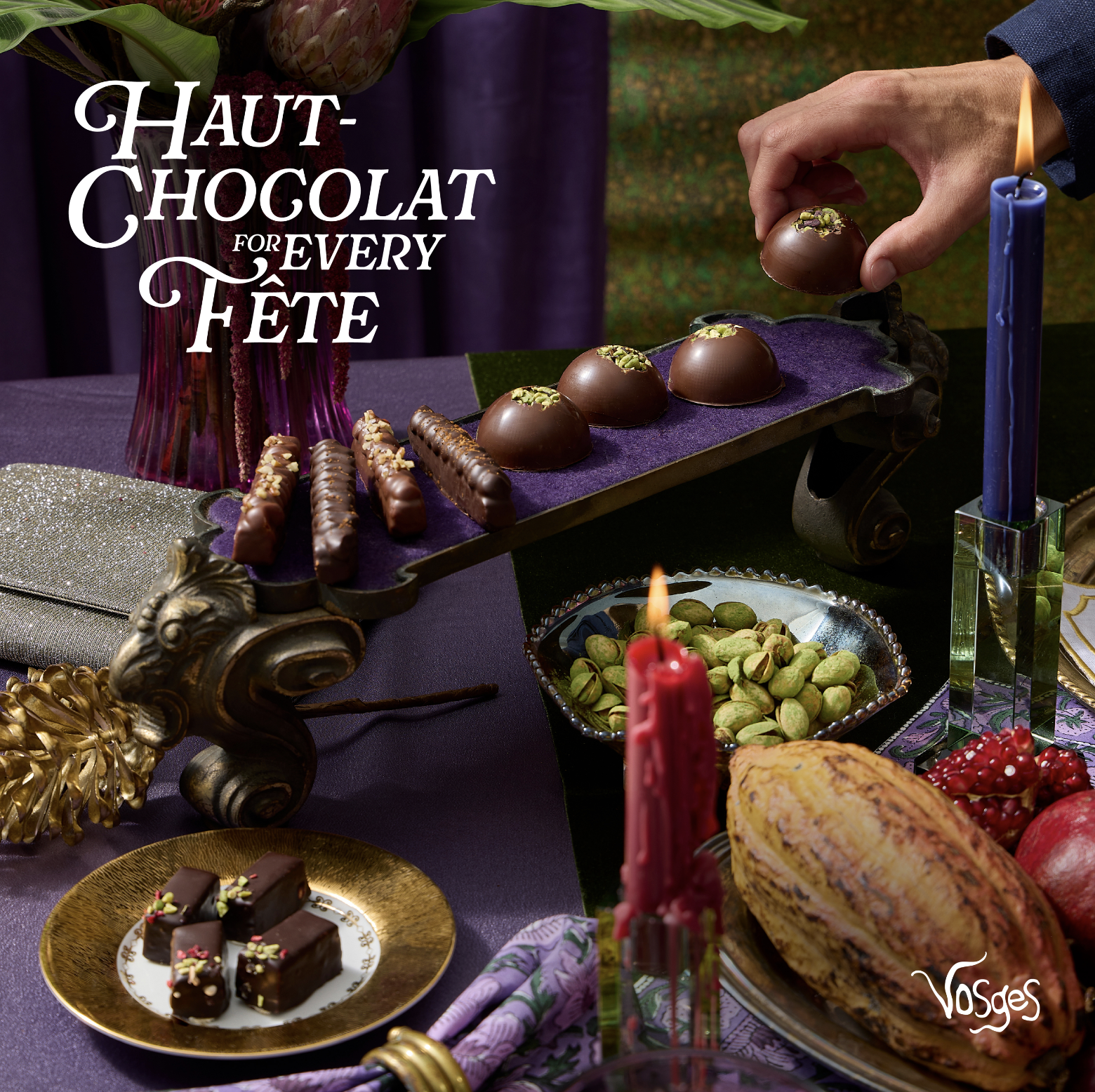
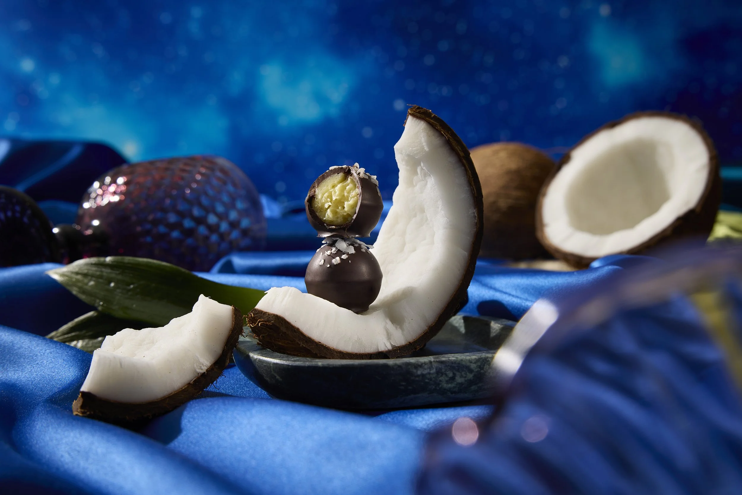
For Vosges's biggest sales season of the year, and largest limited edition collection drop, I built a complete visual world — multiple distinct looks that could work across every channel simultaneously. Advent calendar content launch paired with a bespoke collection drop visual system made the collection sing — and a lifestyle set designed for longevity got us through the full season. All art directed in studio using the layered approach: products isolated, backgrounds standalone, everything built to recombine and extend indefinitely for ultimate flexibility:
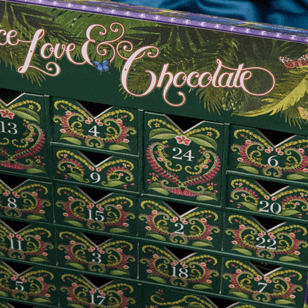
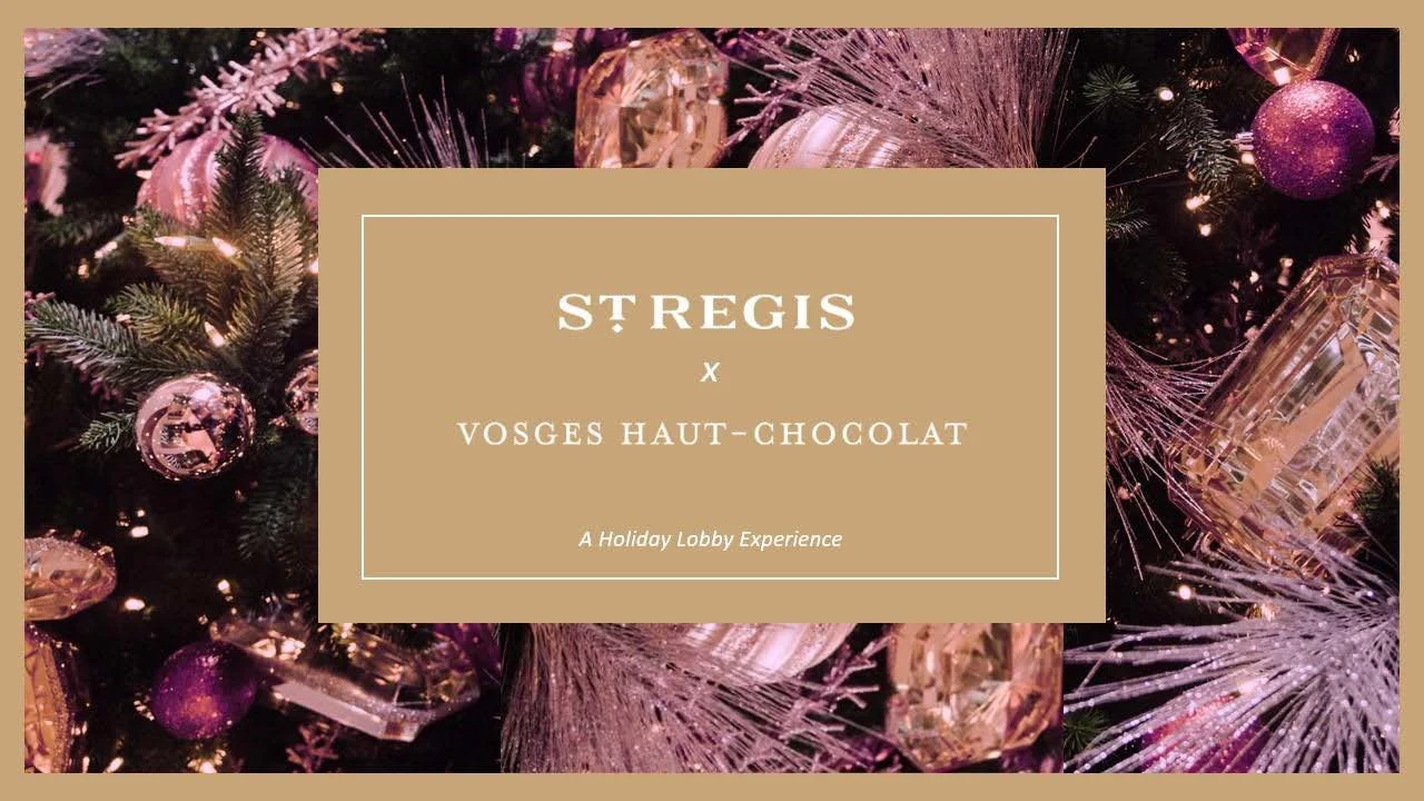
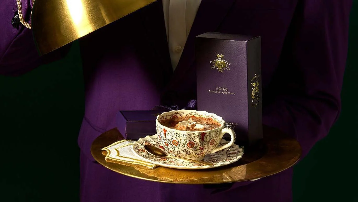
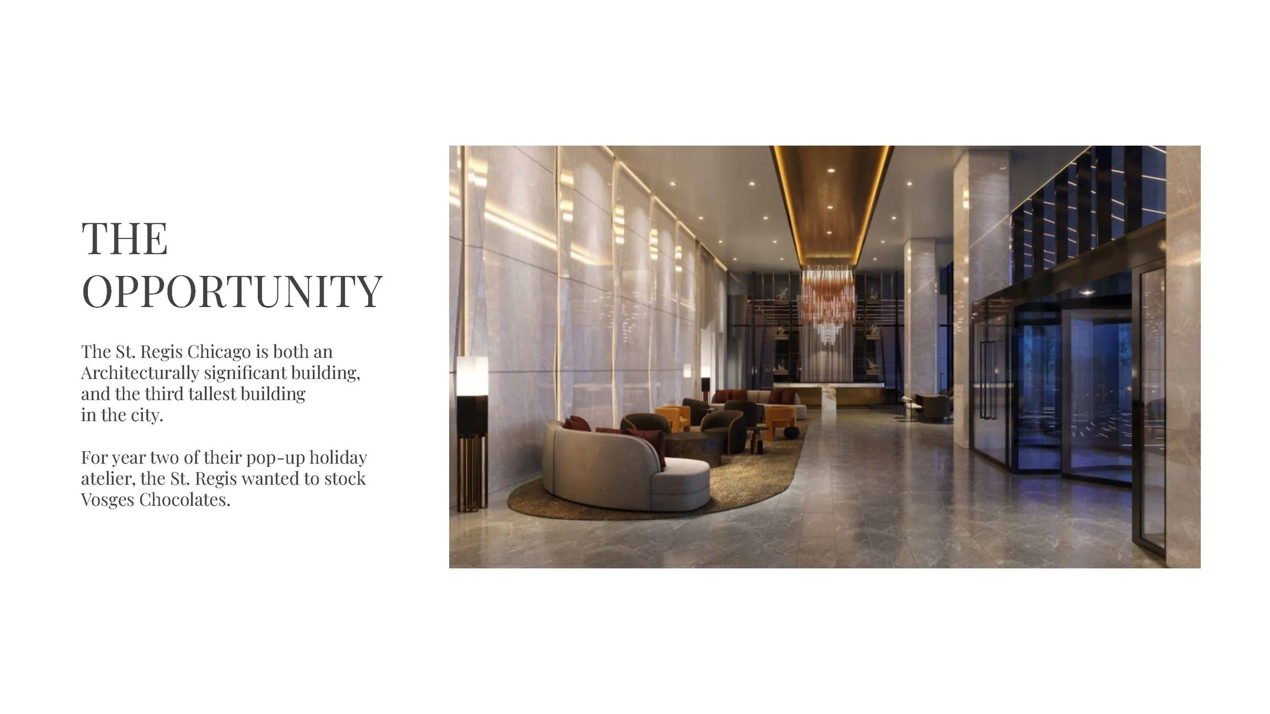
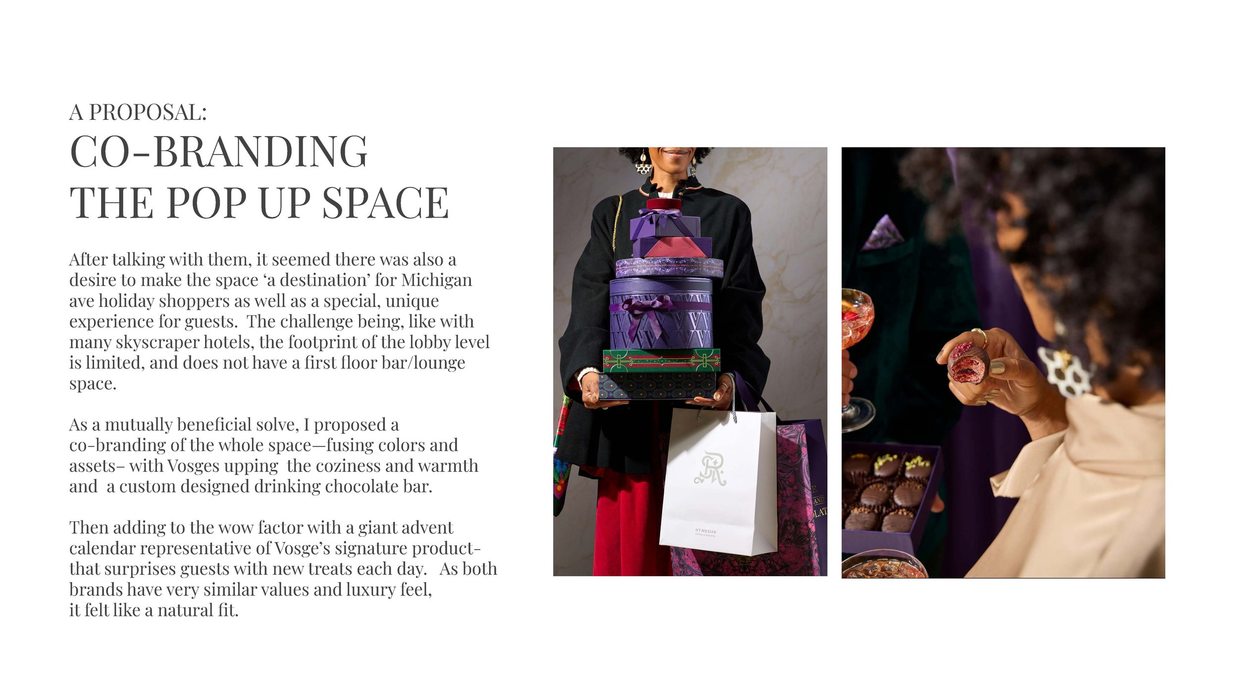
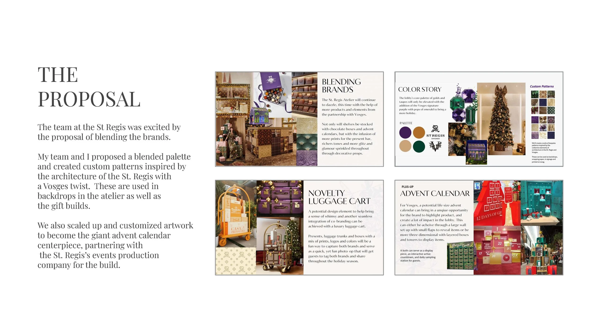
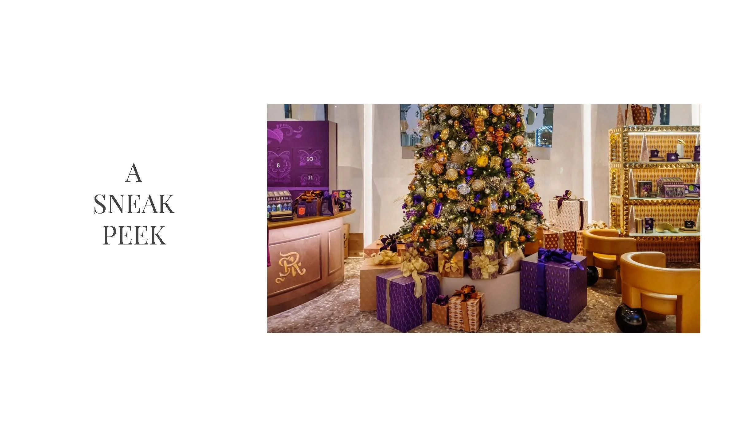
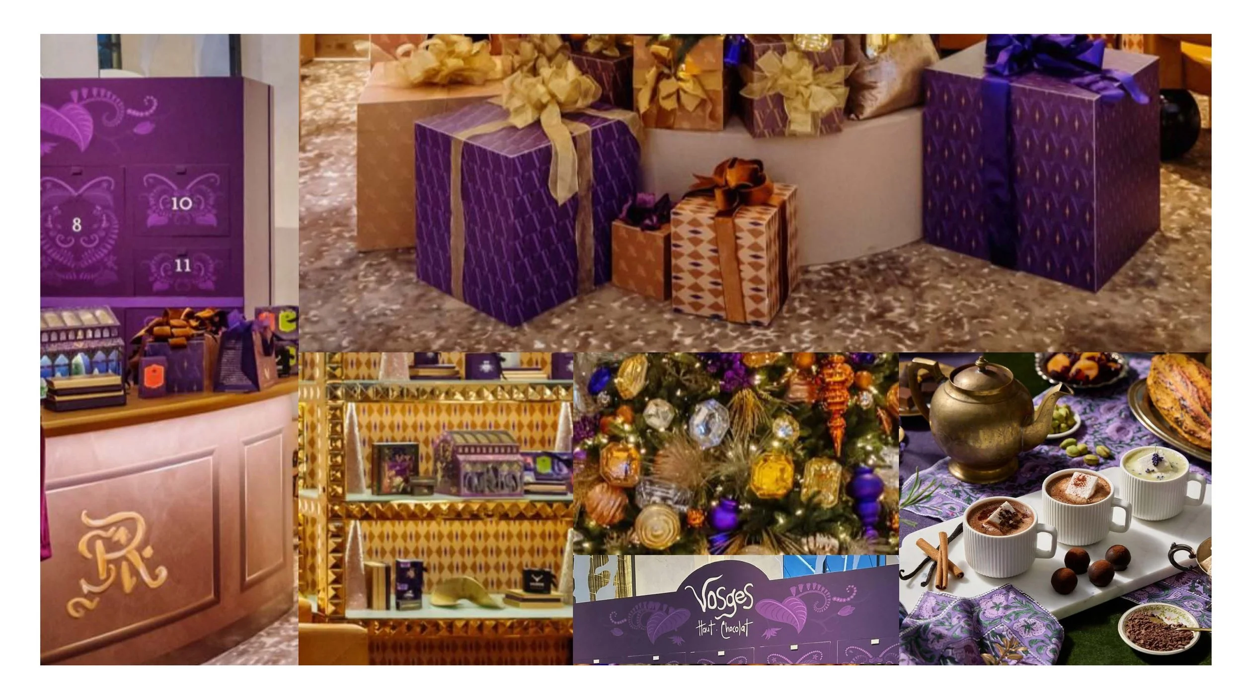
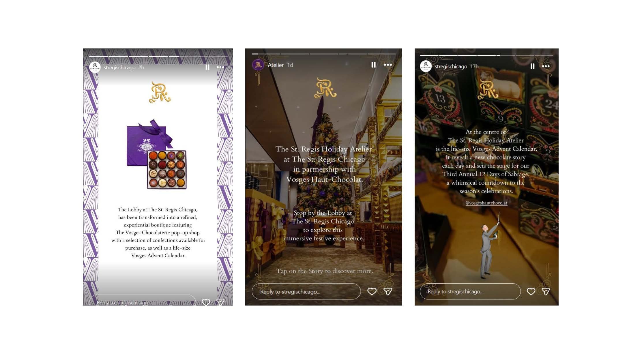
I also produced a launch video, animated content and motion GIFs, making the most out of our seasonal library asset collection. This then led to a collaboration with the St. Regis Chicago on a co-branded holiday lobby experience bringing the world to life. Literally, as it included a giant physical advent calendar installation.
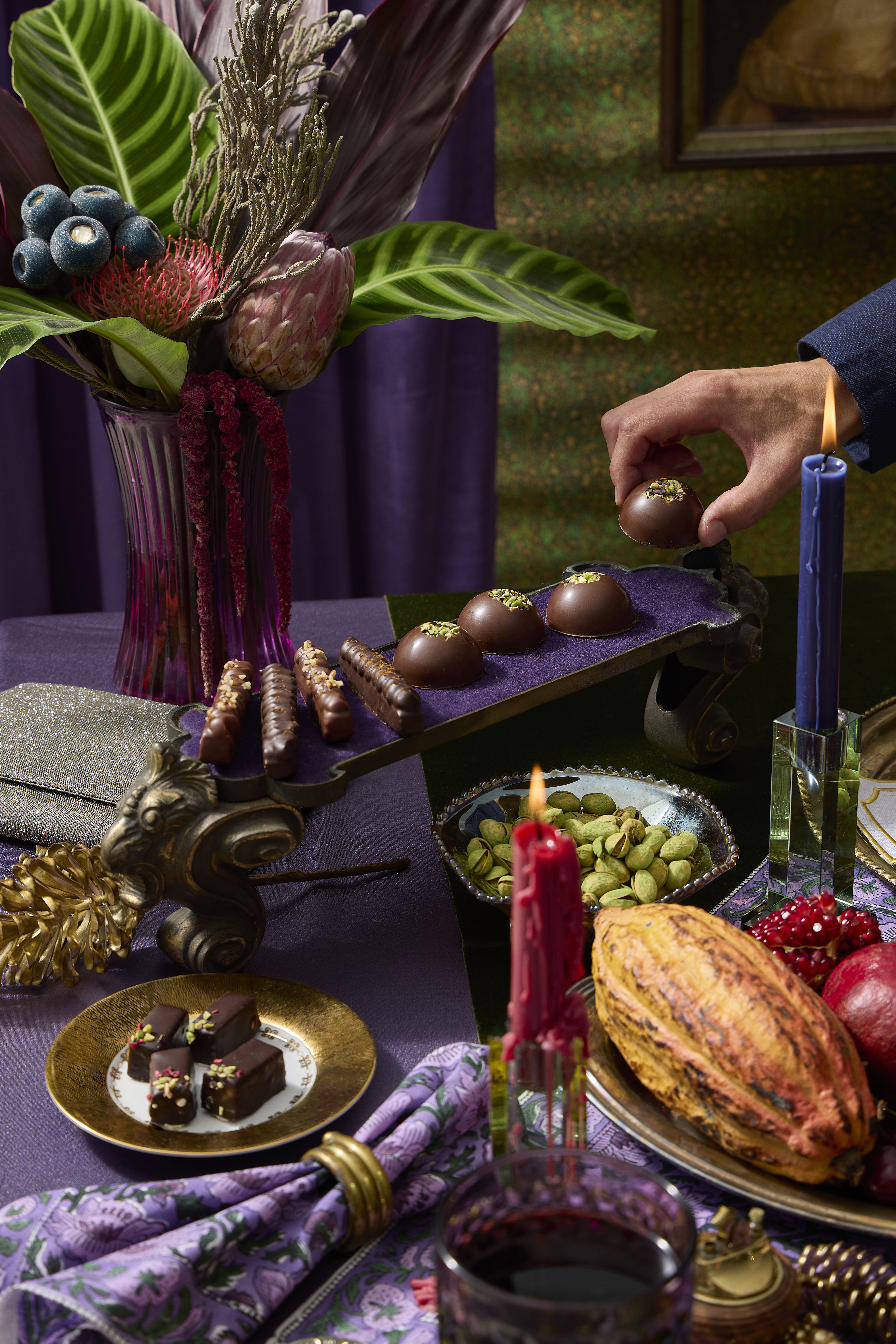
Evergreen photography
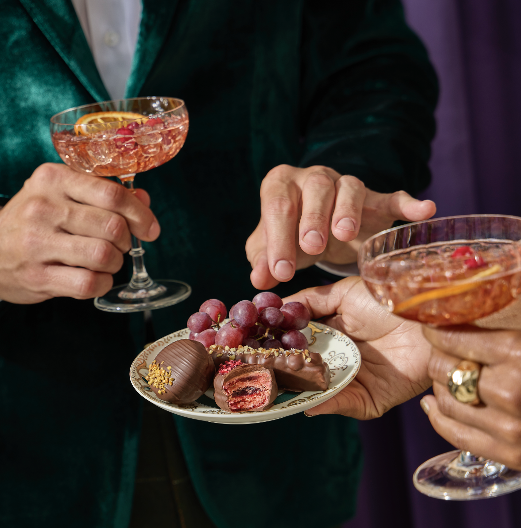
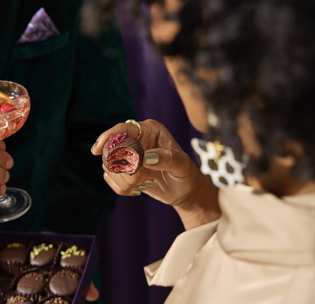
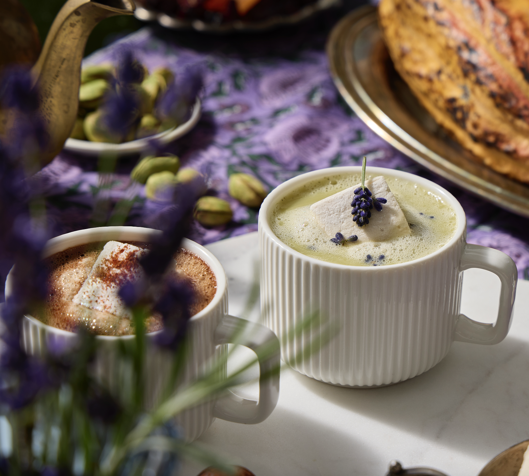
Evergreen studio photography — modular asset library built for year-round deployment
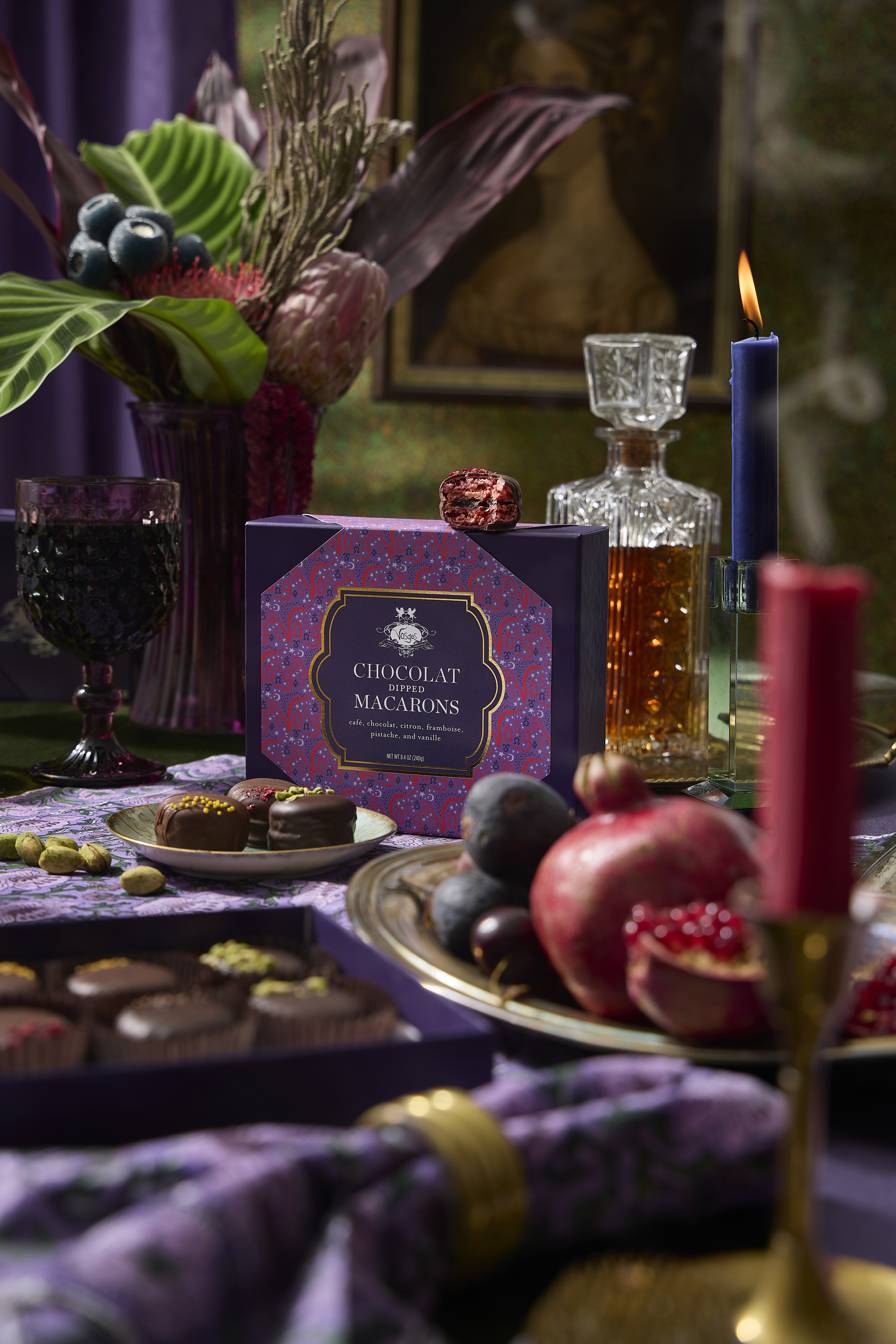
Advent & holiday campaign
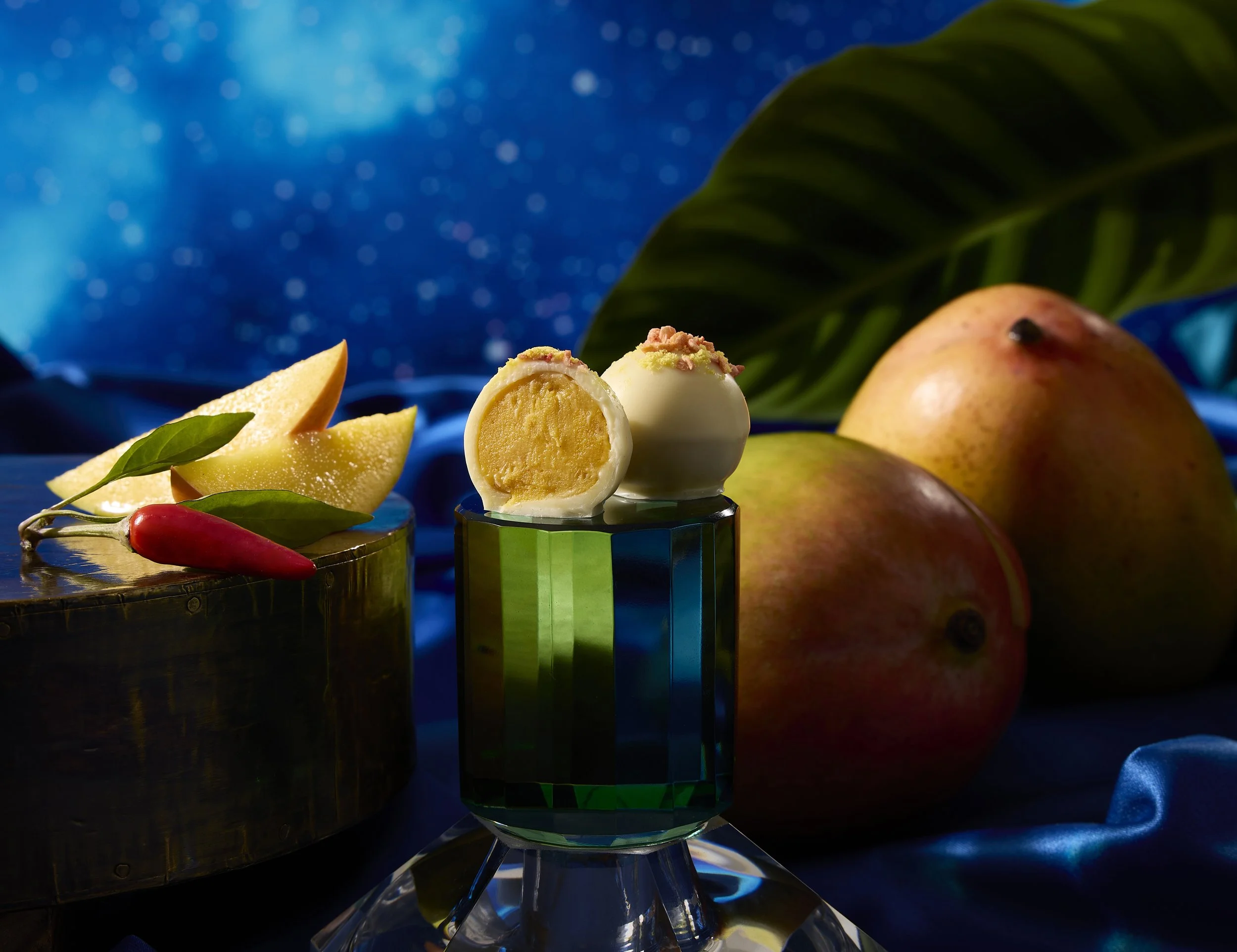
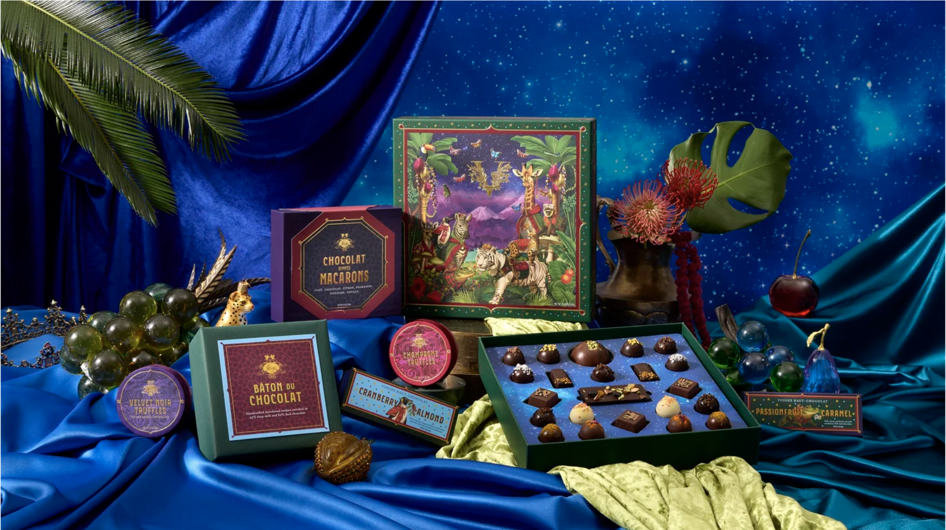
Advent & holiday campaign — photography
Co-branded holiday lobby experience with the St. Regis Chicago — including a giant physical advent calendar installation. Full build-out design and co-brand system.

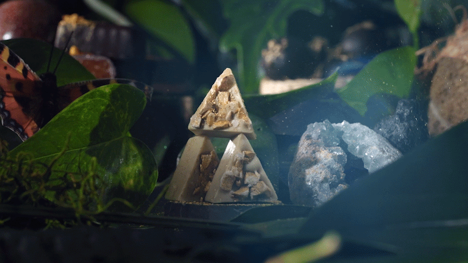
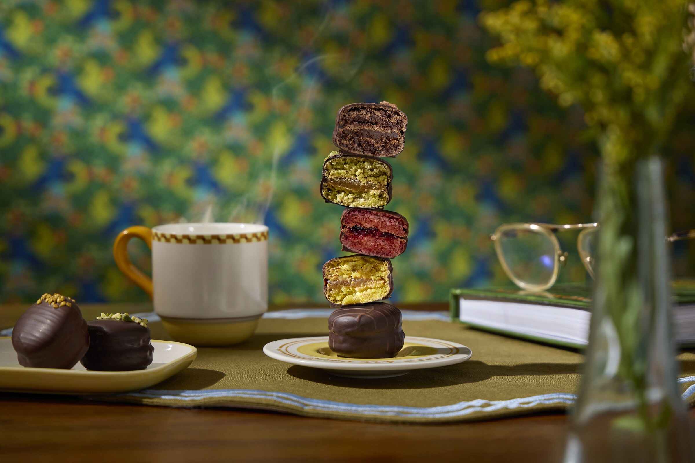
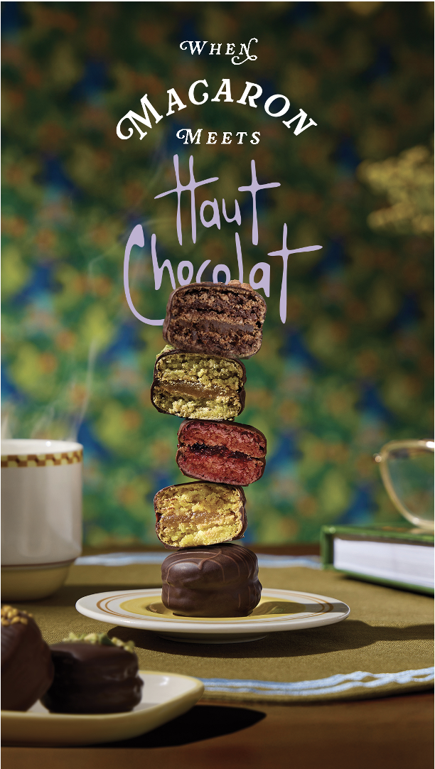
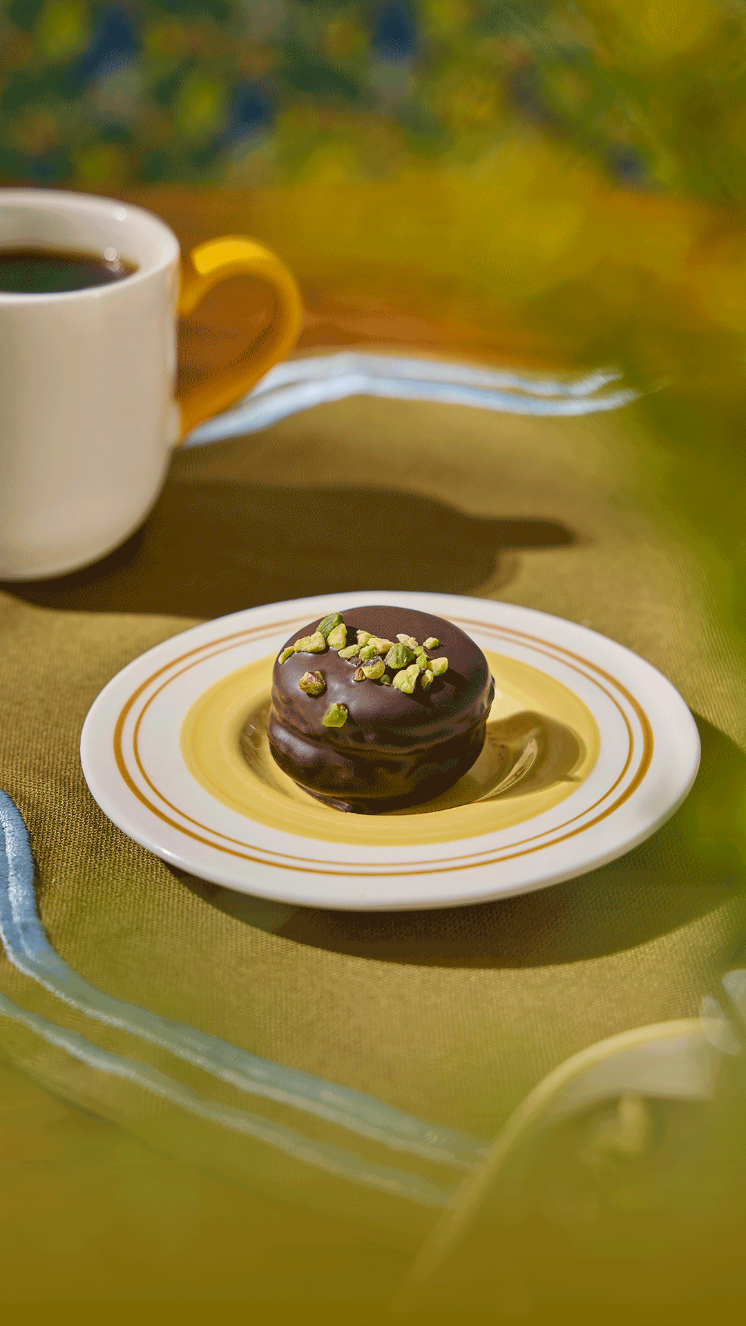
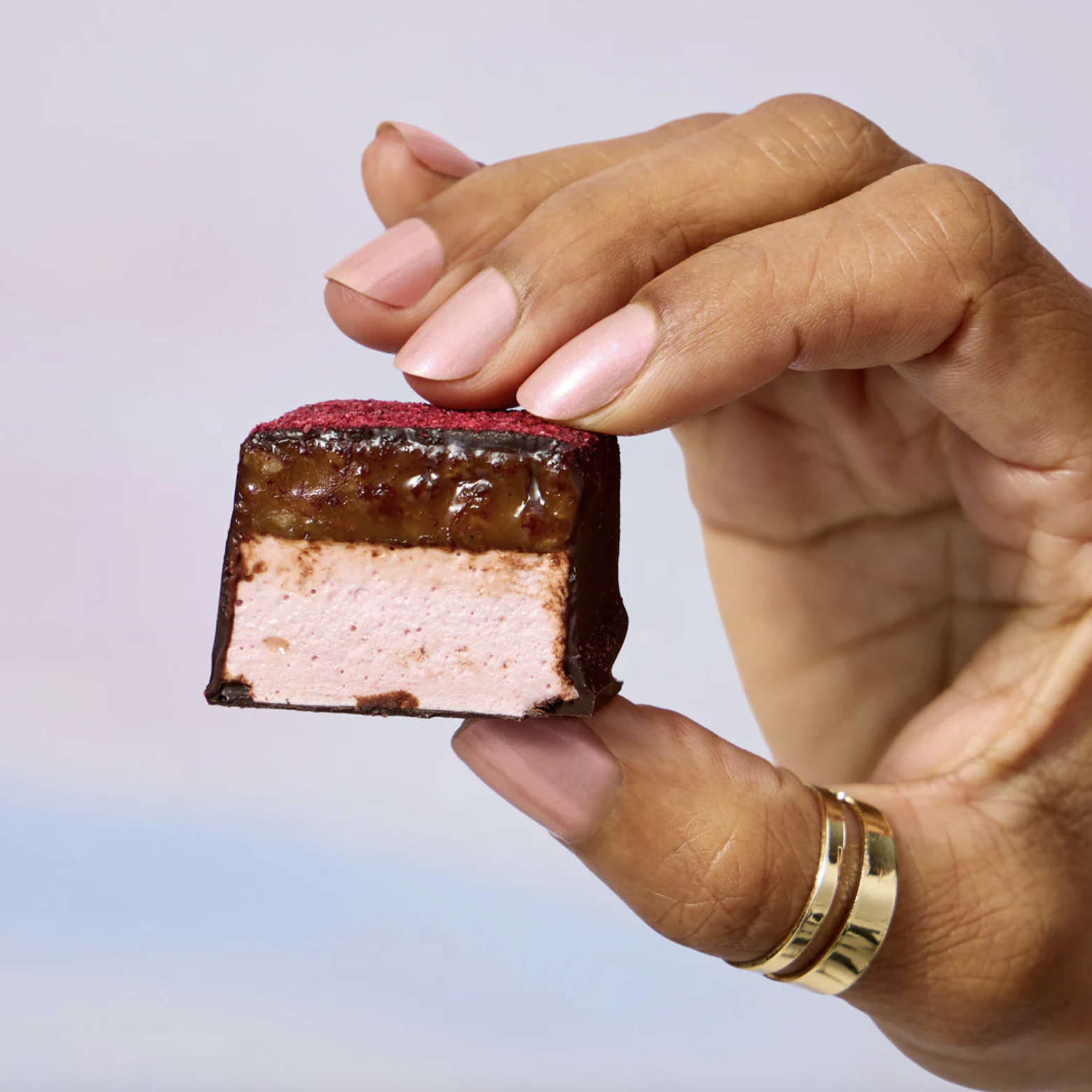
No time. No budget. A chocolate-covered macaron — the first of its kind for Vosges — and a real problem: you can't see the macaron when it's in its final chocolate-covered state. How do you explain to a consumer what they're buying when the product itself doesn't show what it is?
The solve came literally on set. We were already shooting something else when I saw the opportunity. I got hands-on with the set design and direction — my photographer partner welcomed it — and we squeezed in a few shots that solved the problem creatively: showing the macaron in its stages, styling it in a way that communicated both what it was and how delicious it looked.
The full launch — photography, social assets, web, and email — did the work to explain what it was while making it look irresistible. The macarons flew off the shelves.
Macaron launch — concepted and shot in a single studio session
The idea came while on set. The shoot was already happening. That's the skill — knowing what to do with a moment when you see it.
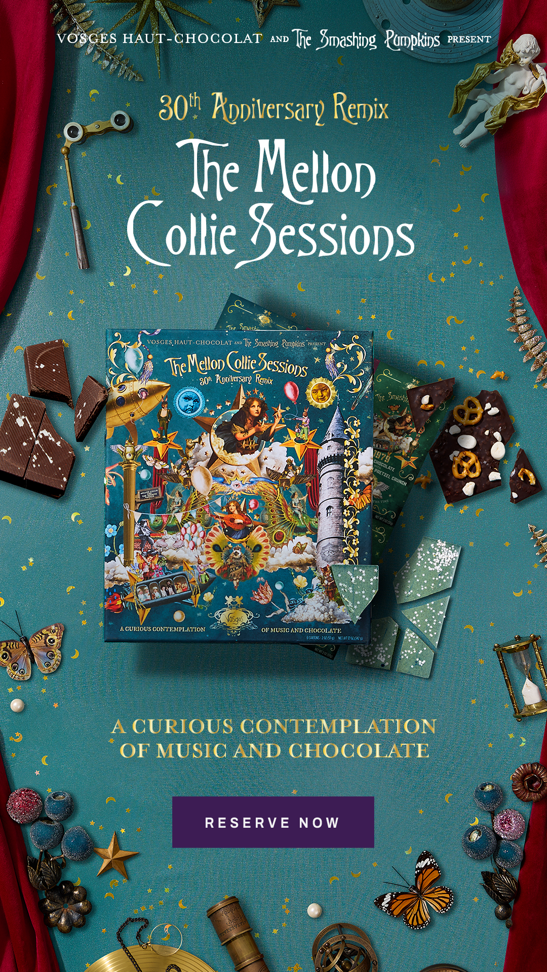
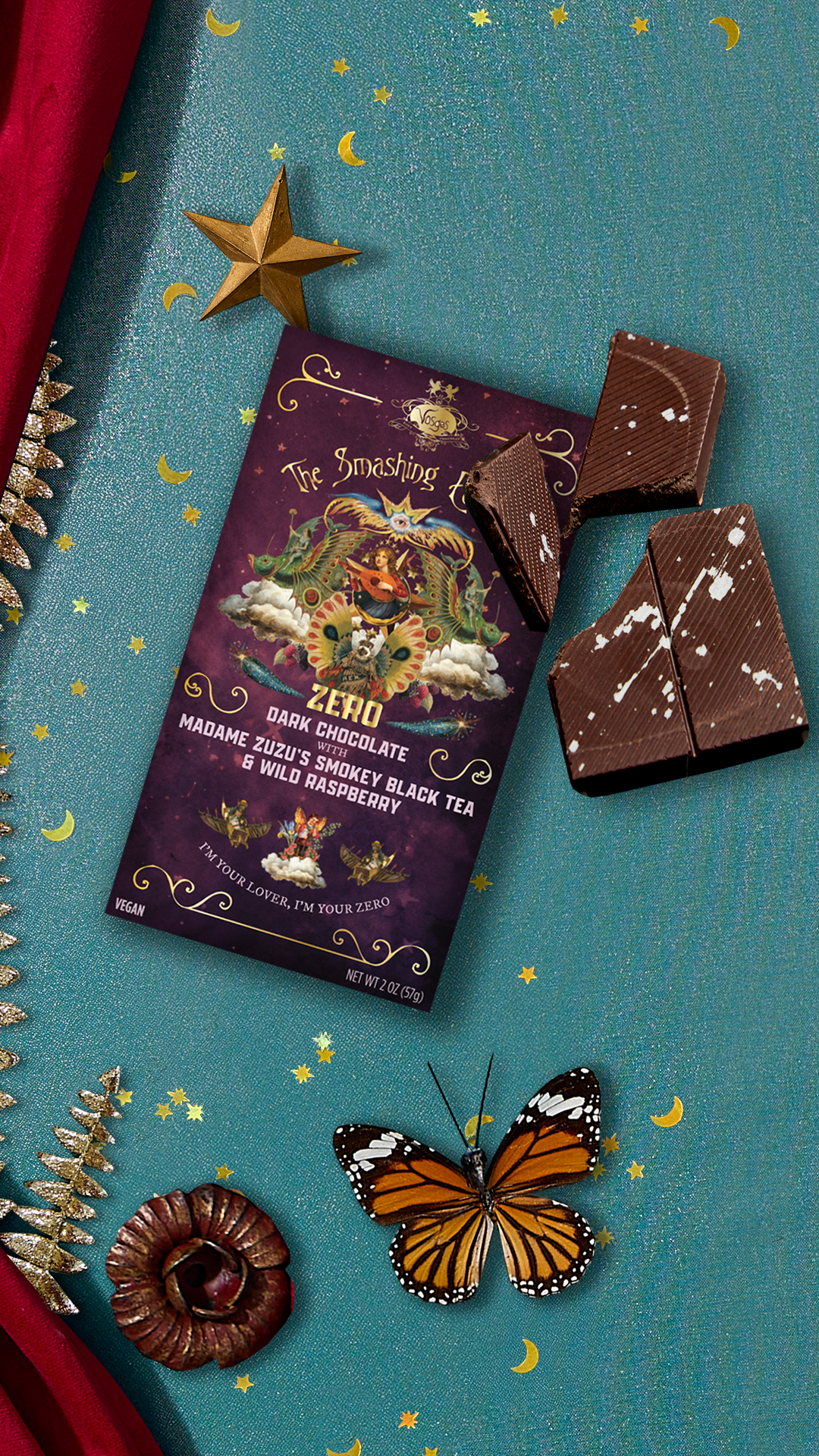
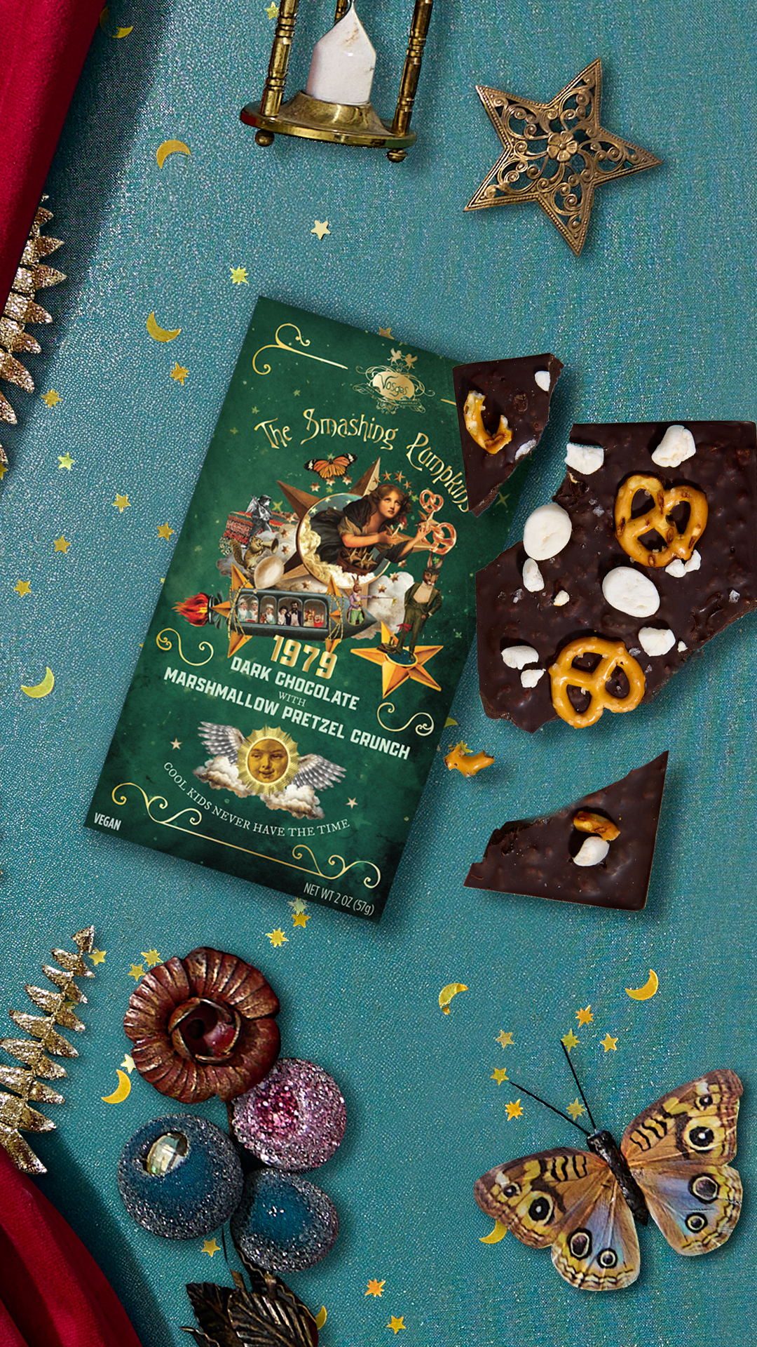
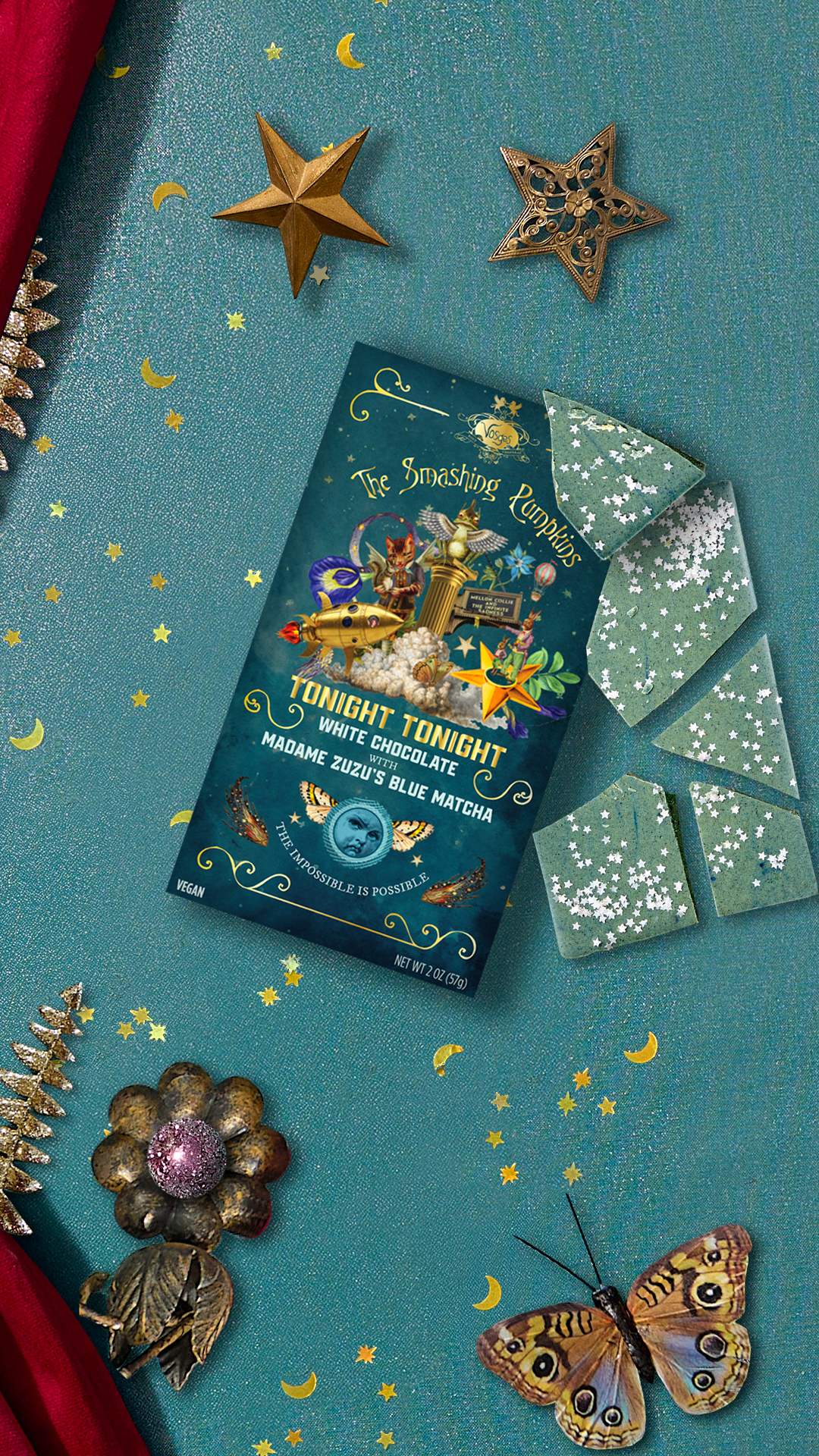
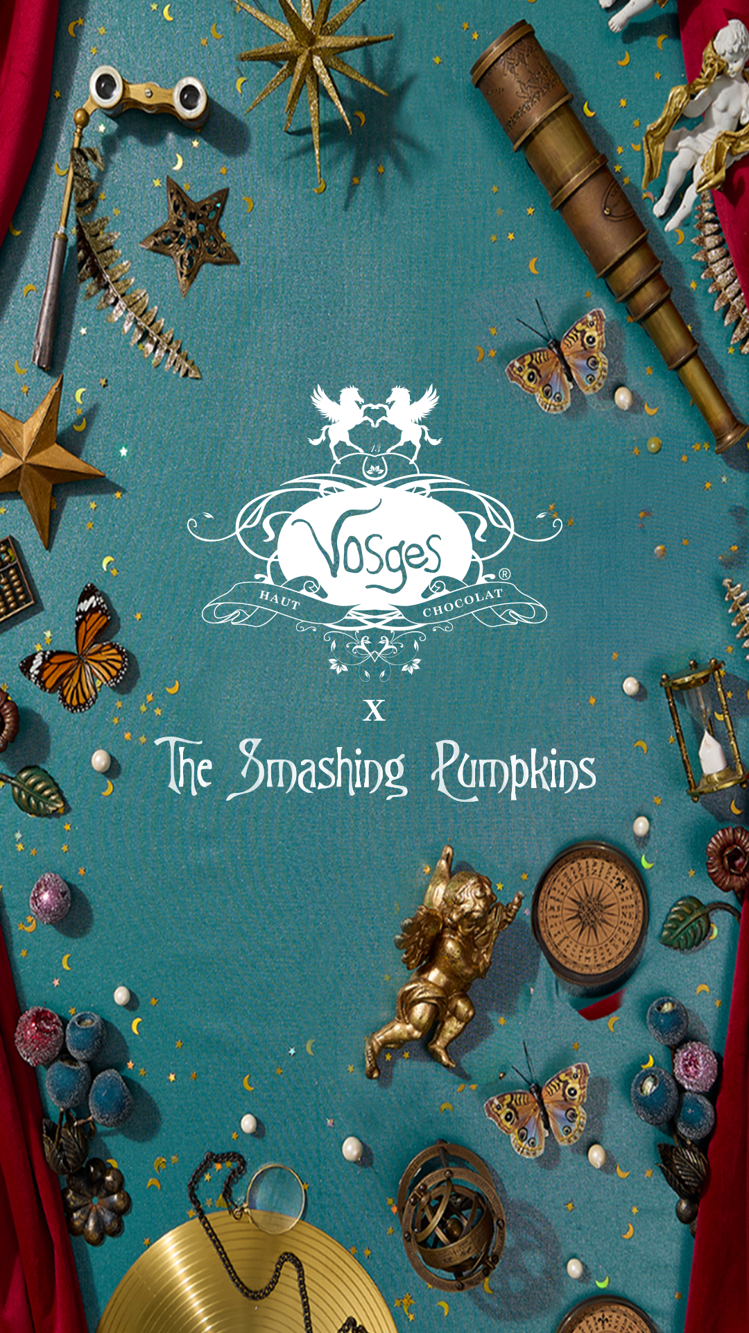
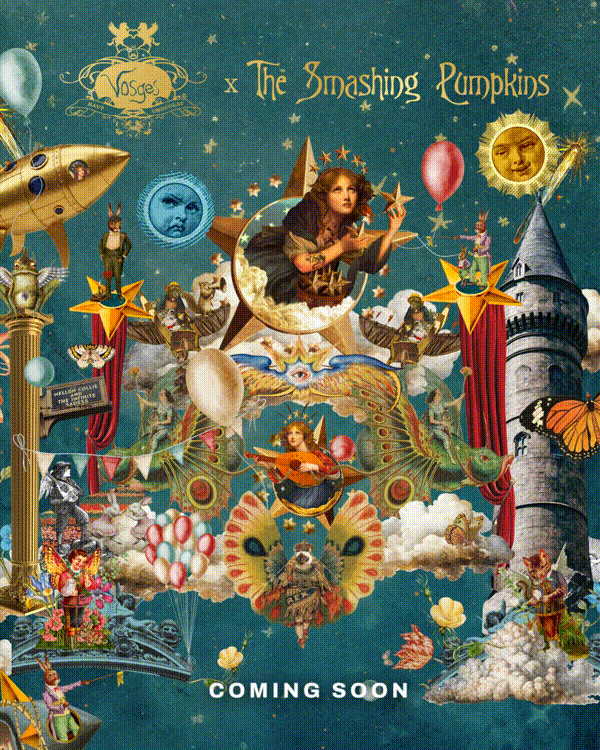
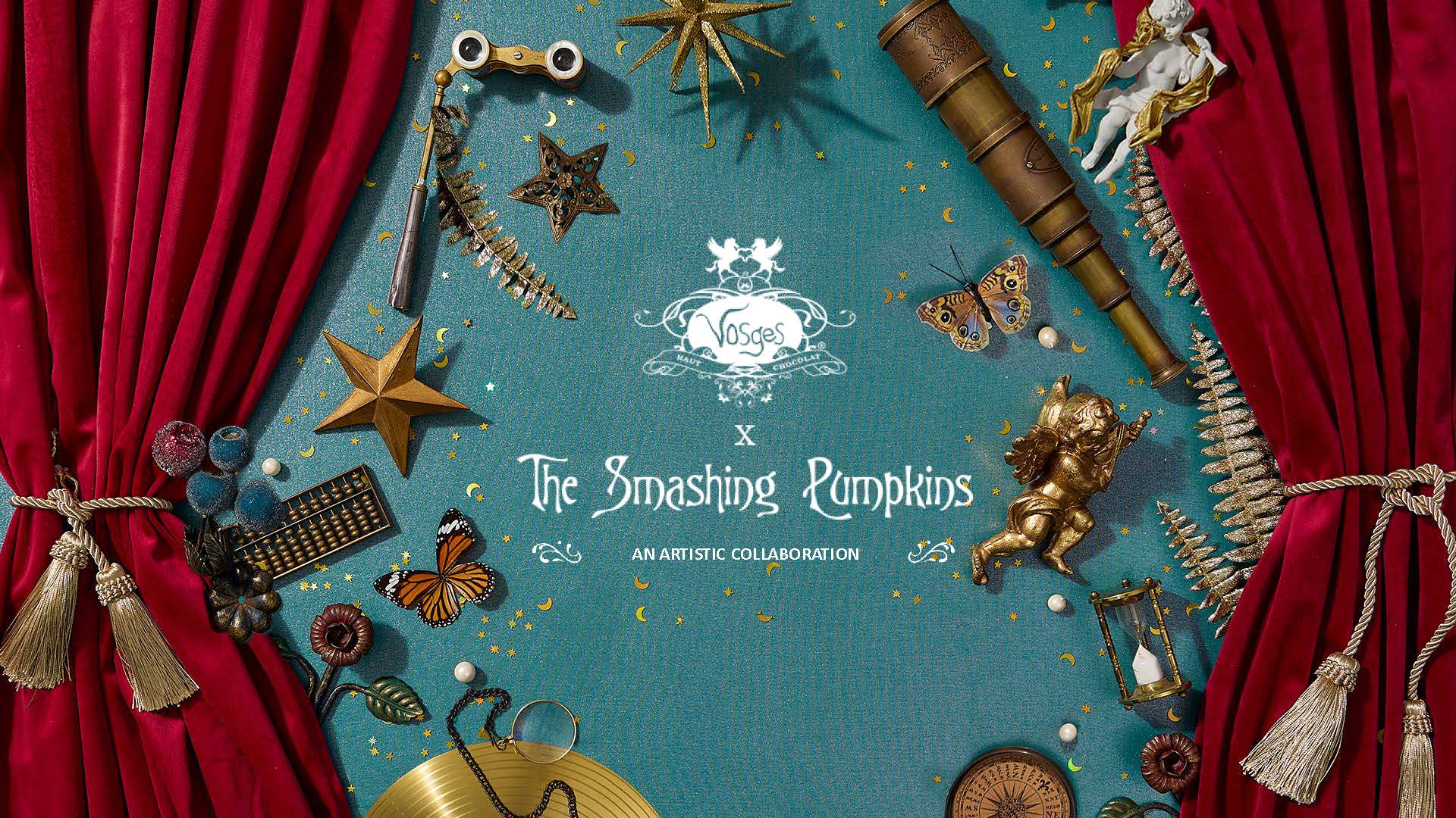
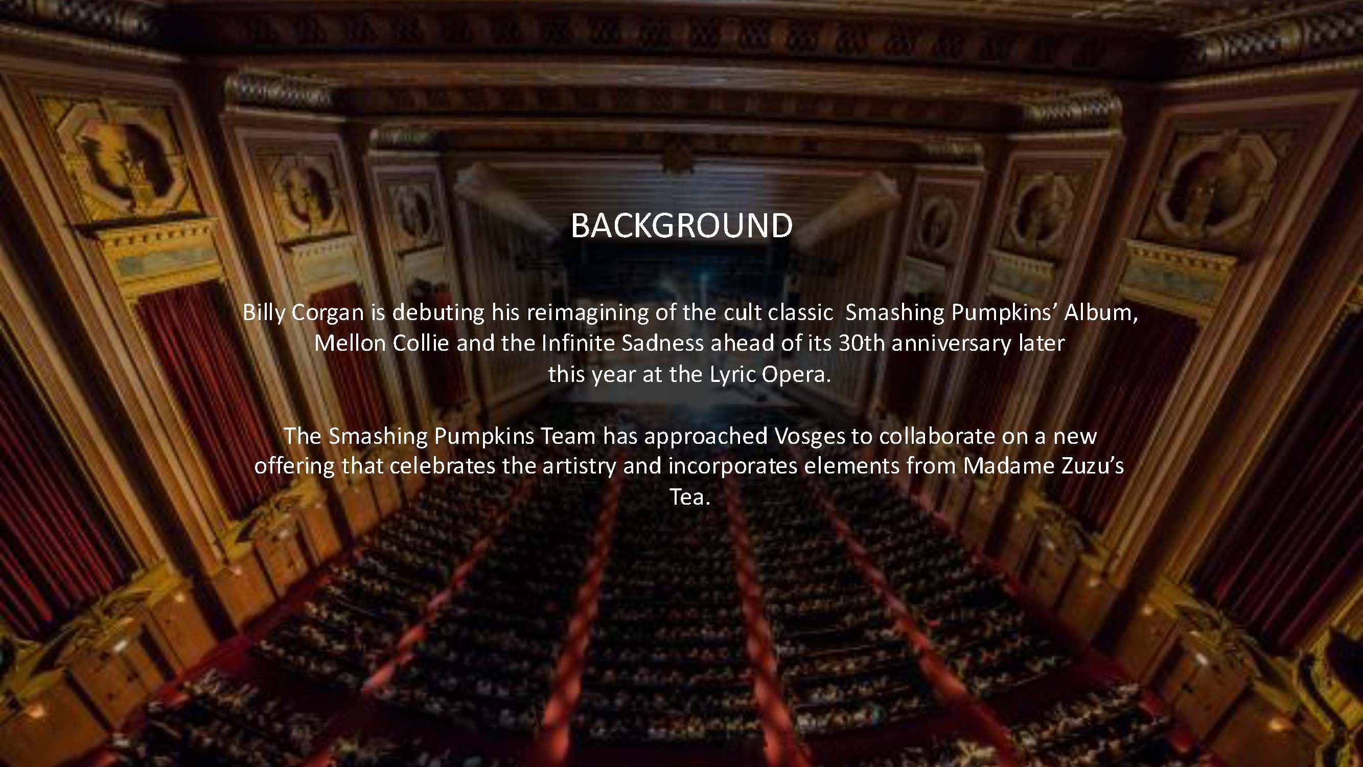
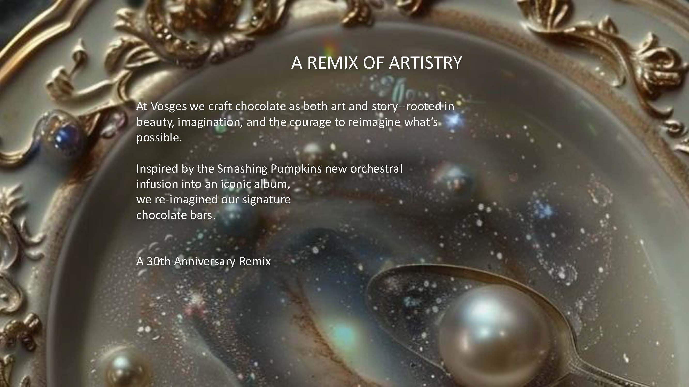
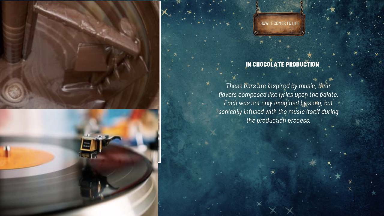
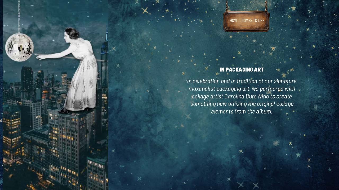
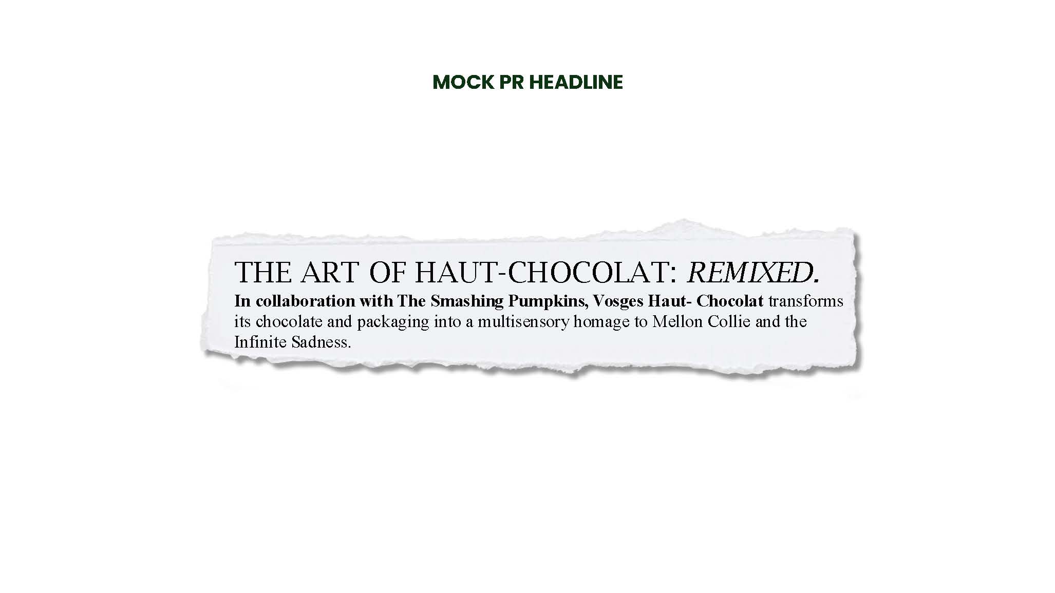
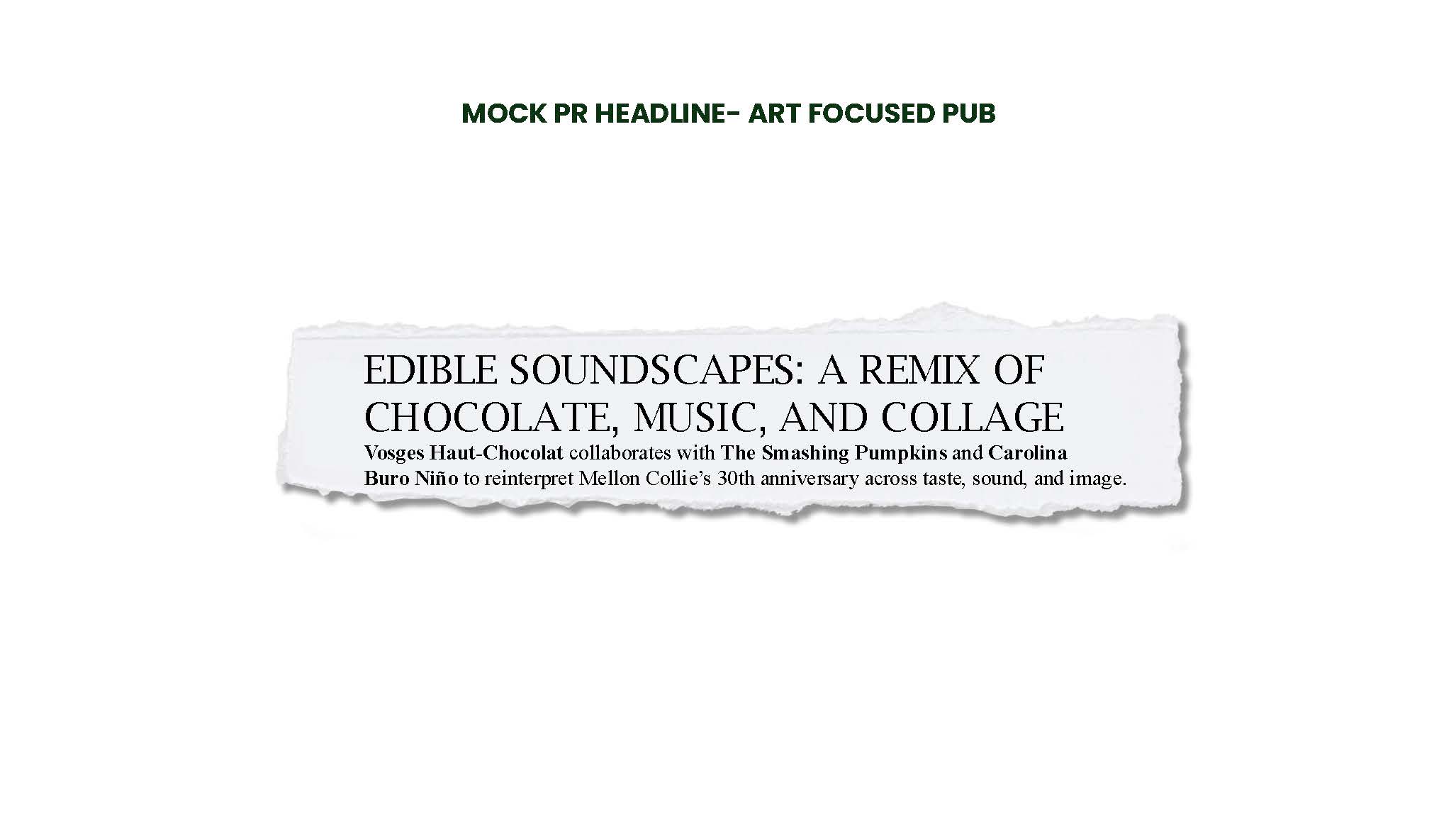
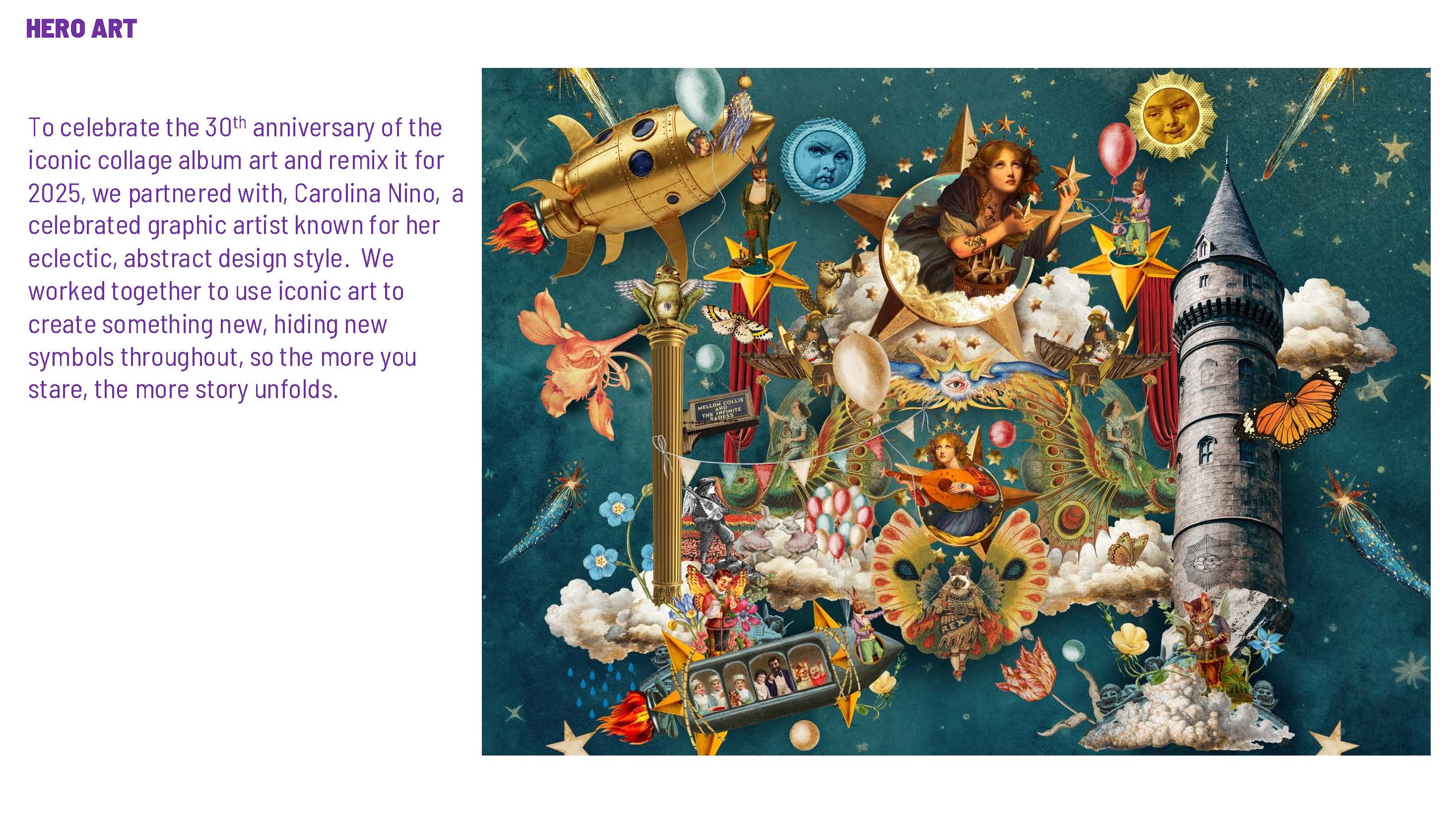
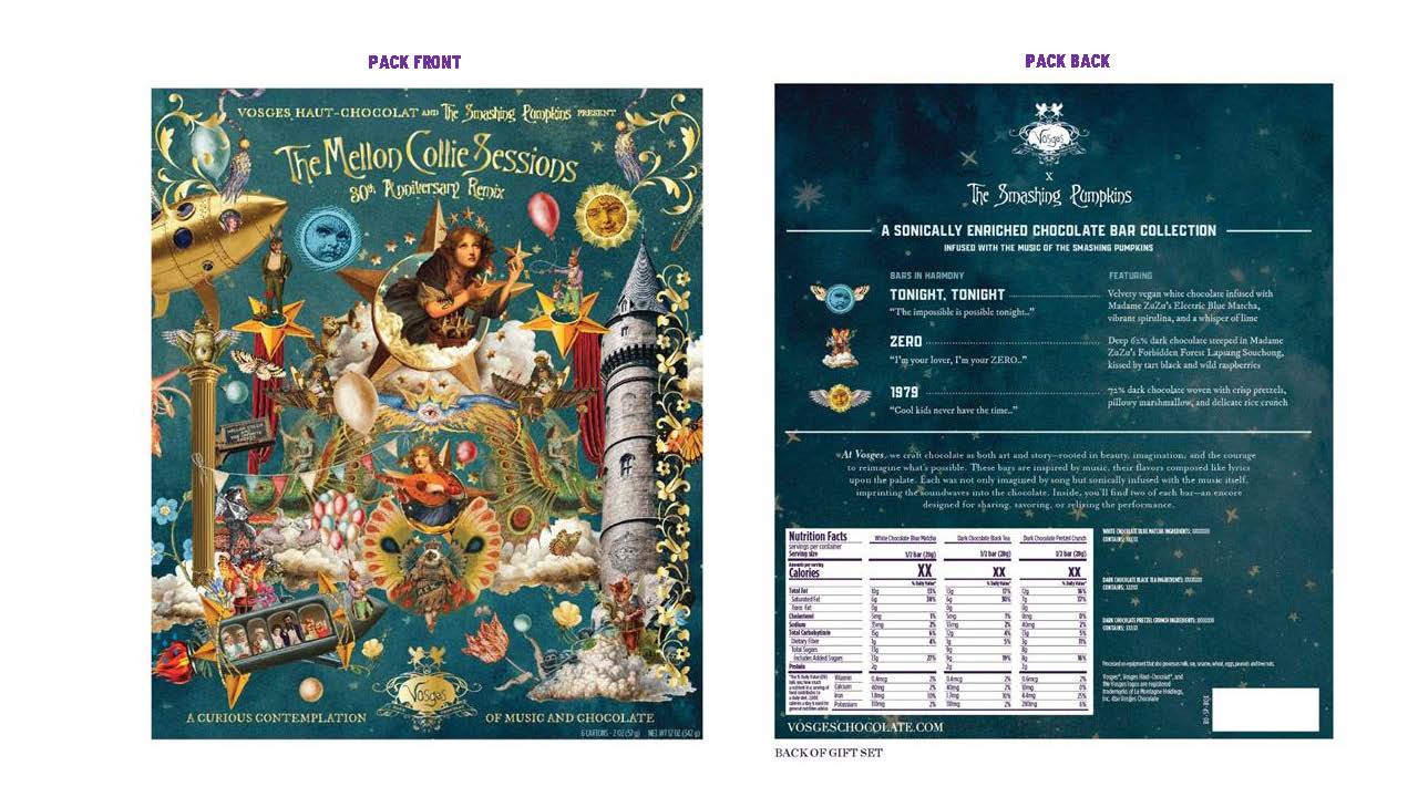
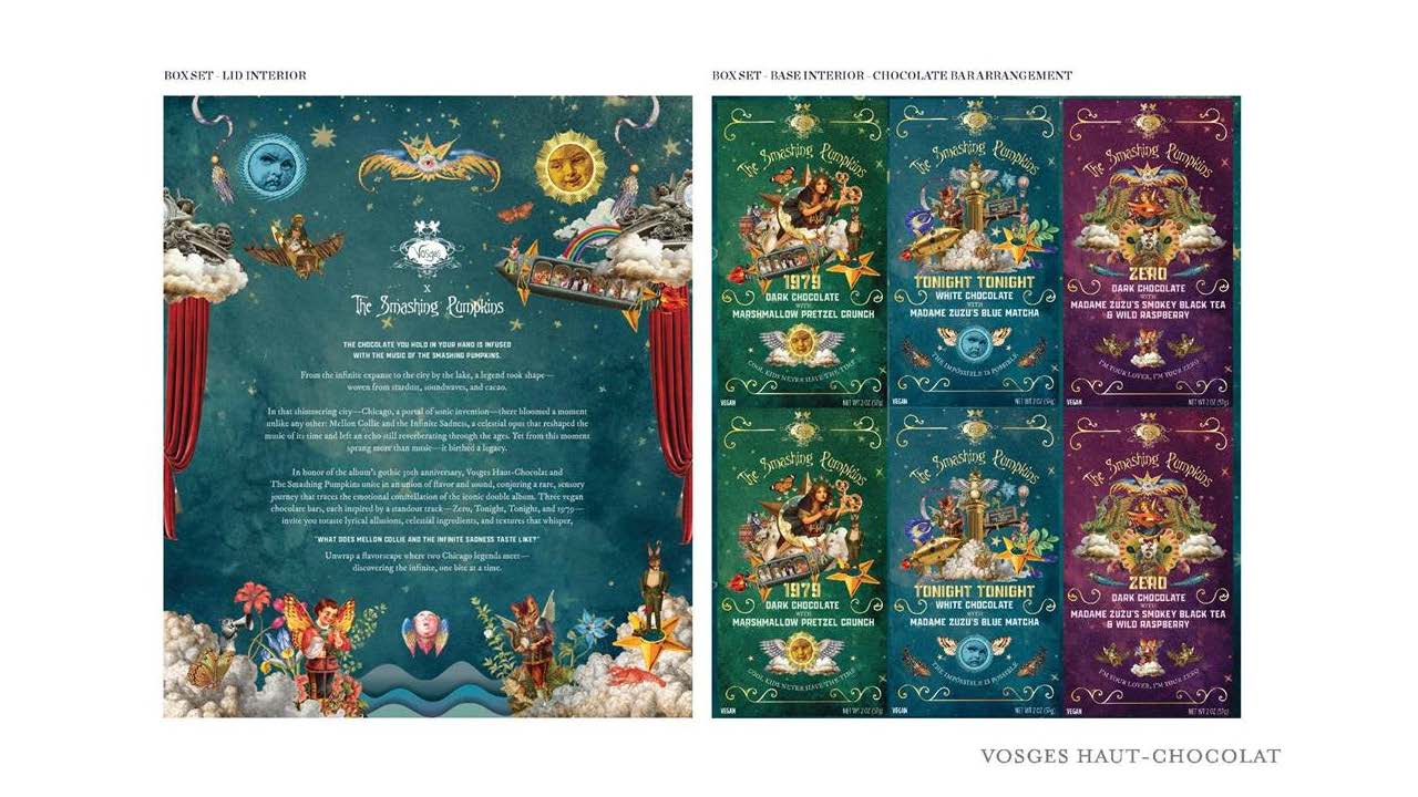
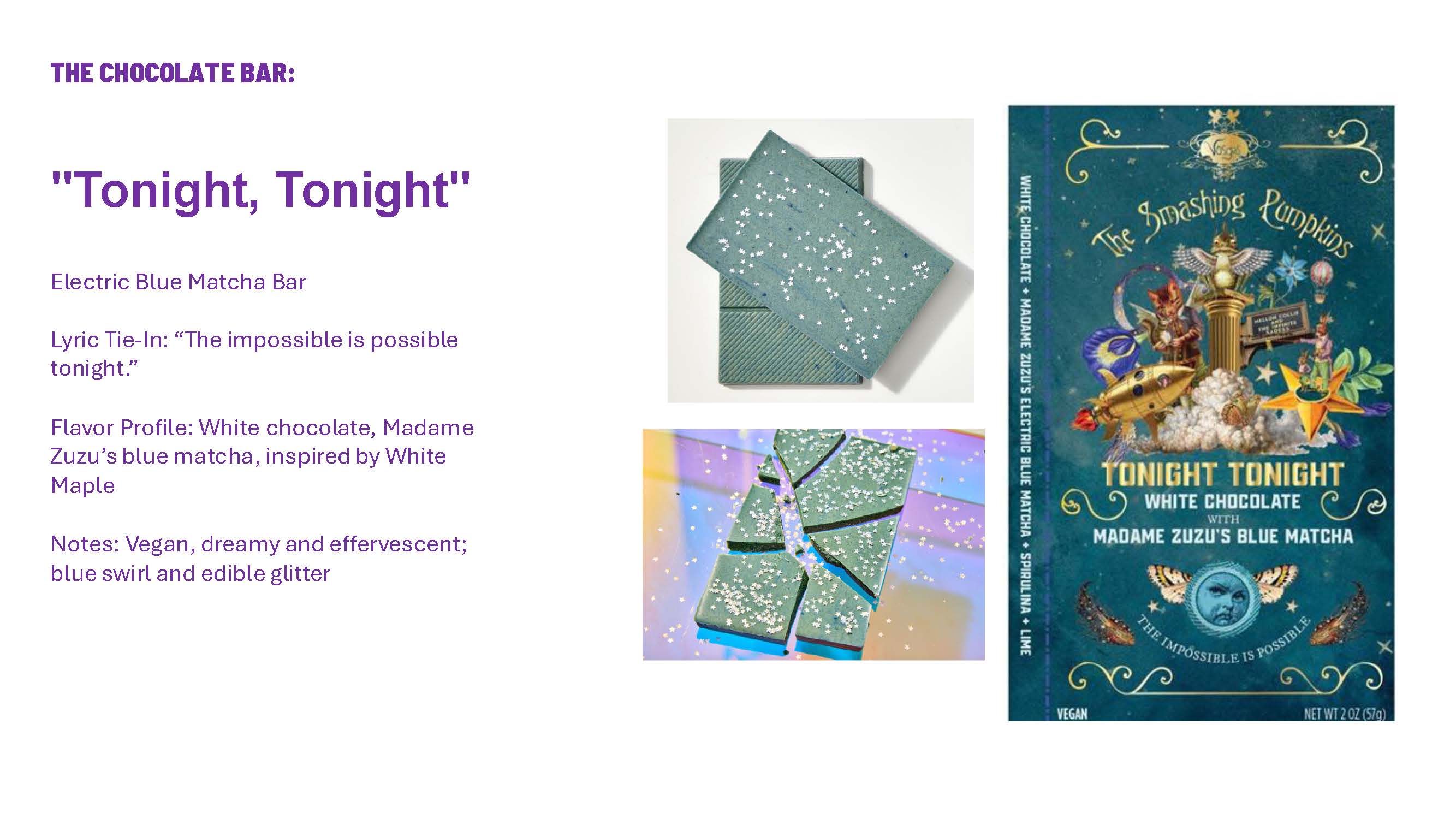
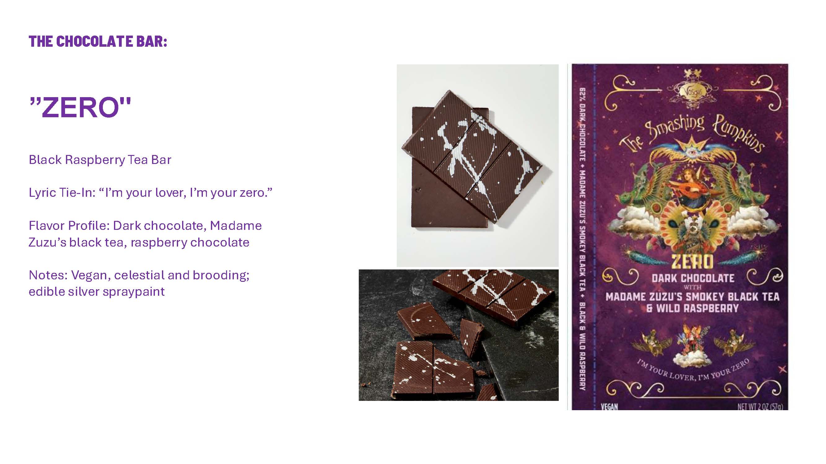
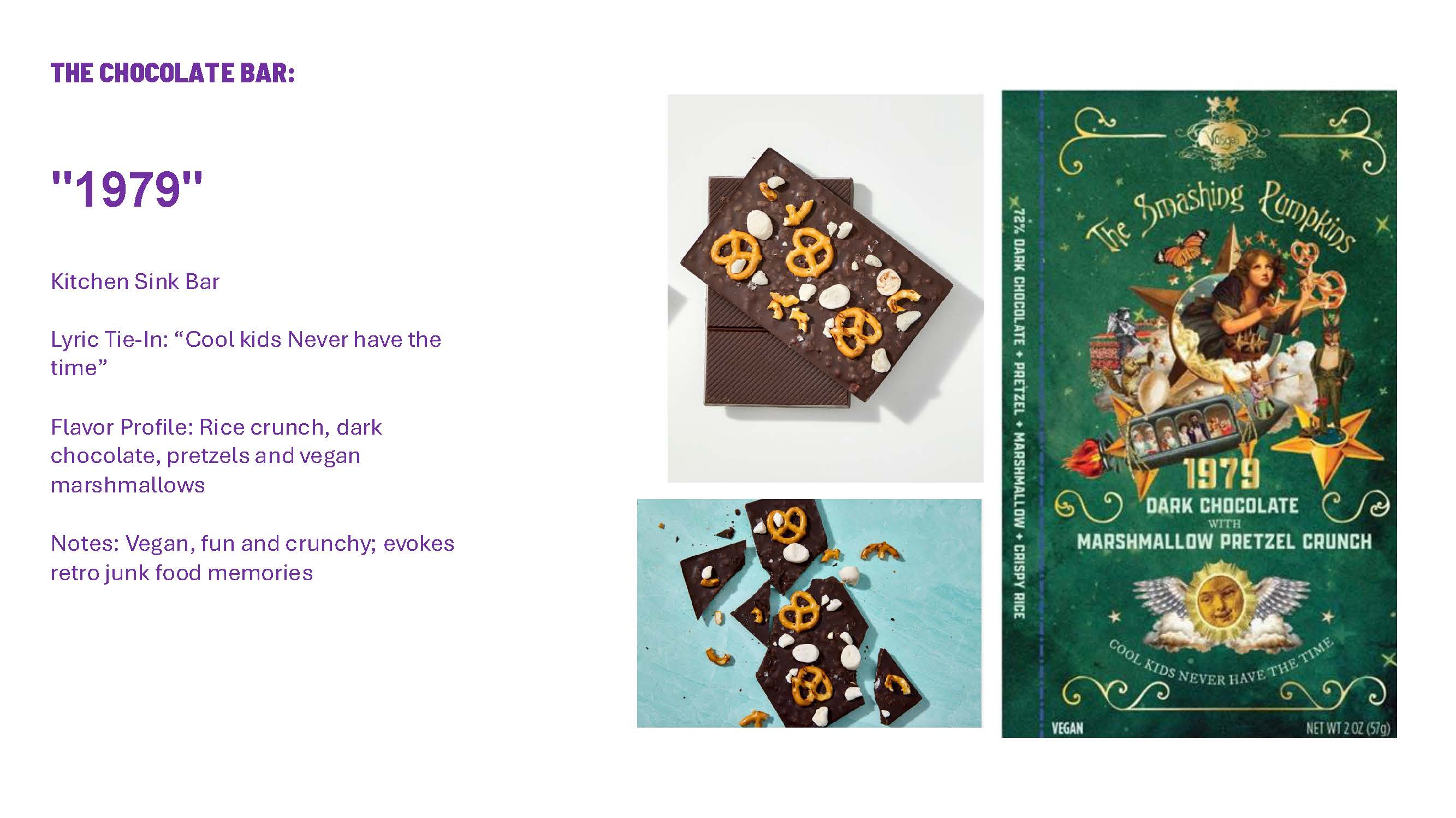
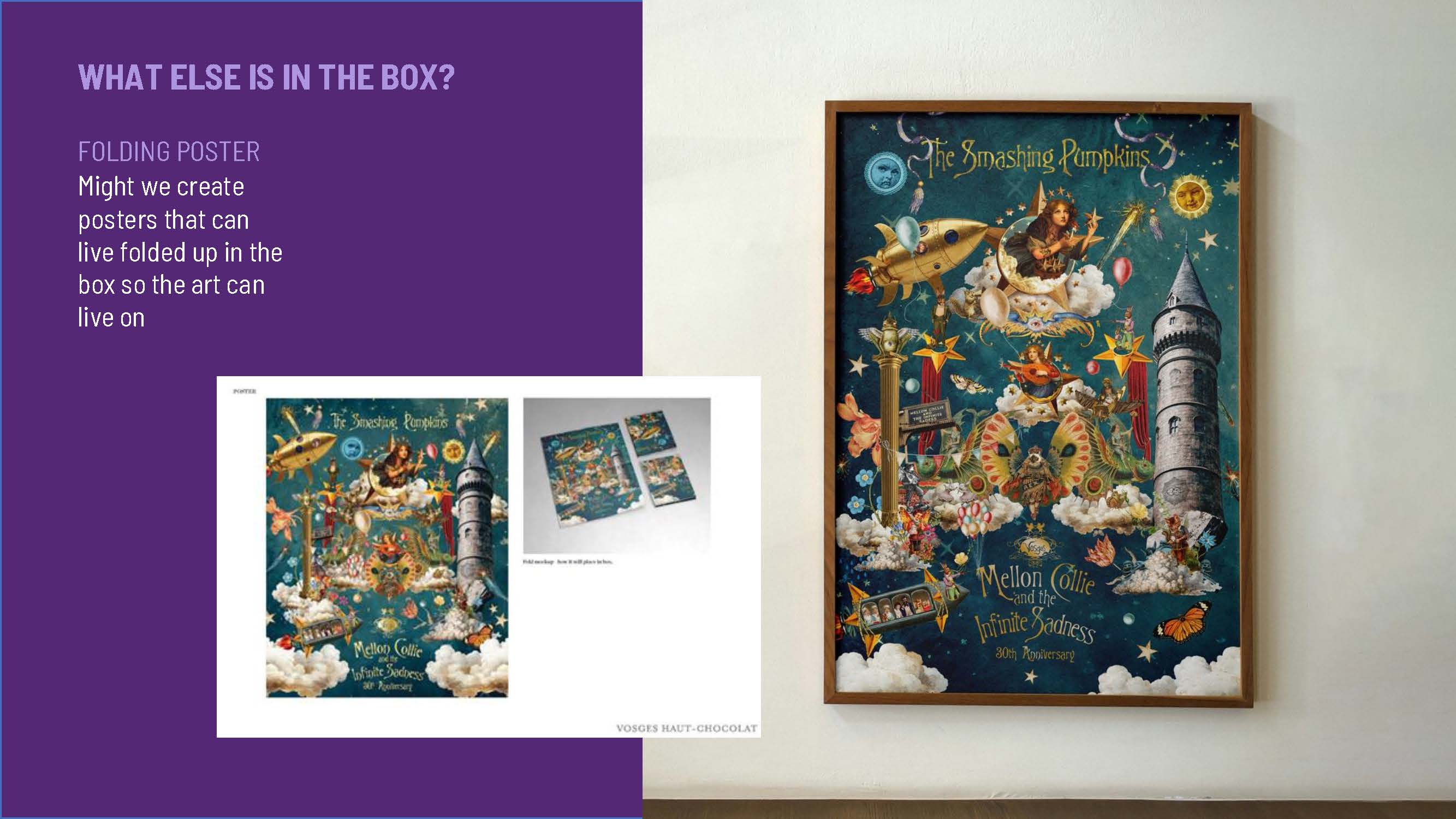
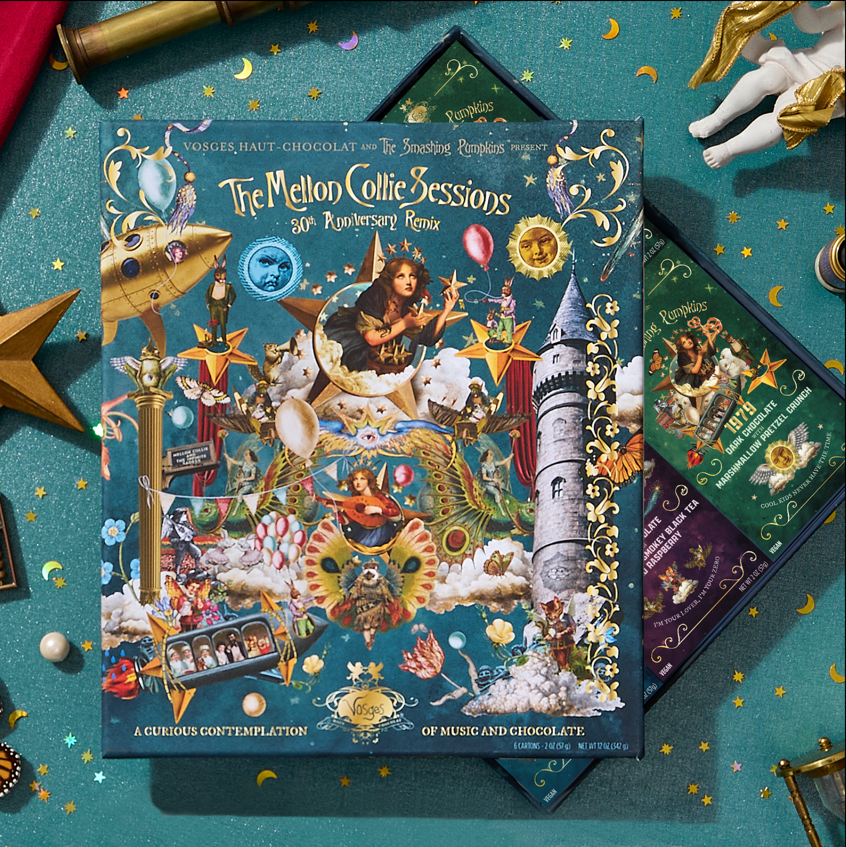
Vosges × The Smashing Pumpkins. Two worlds that didn't obviously belong together — until I found the through-line. The concept: reimagining. Reimagining an album. Reimagining recipes. Reimagining album cover art for a special edition package full of easter eggs that connected the dots for fans.
I commissioned an artist to apply this concept to the packaging — making something new out of the original album artwork, with hidden references woven throughout. "A Remix of Artistry" — bringing two brands together through craft and creative vision. Then repurposed the art and the concept into a full campaign: motion, social, paid, and product storytelling. Each chocolate bar named after a lyric. Each flavor profile matched to the song's feeling.
Built on an extremely accelerated timeline with scrappy resources. The work held together because the idea was airtight.
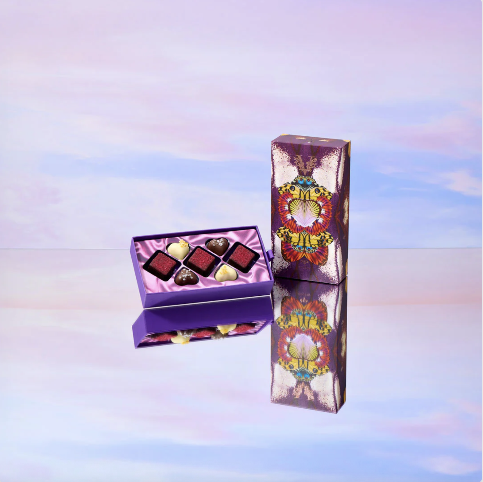
Package design
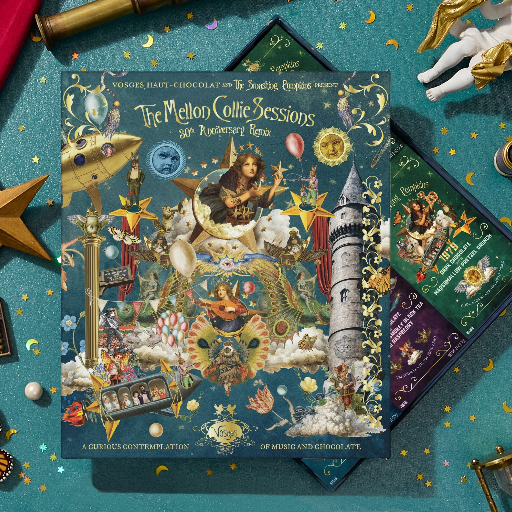
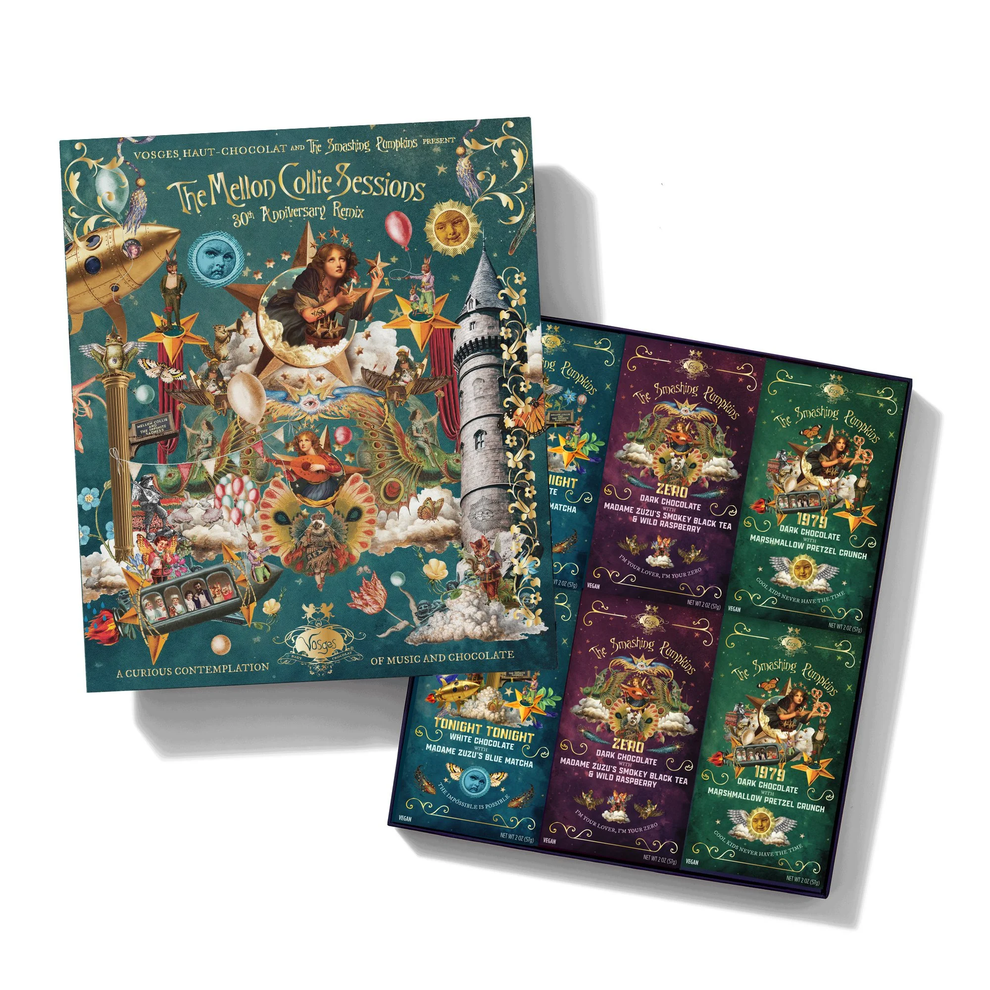
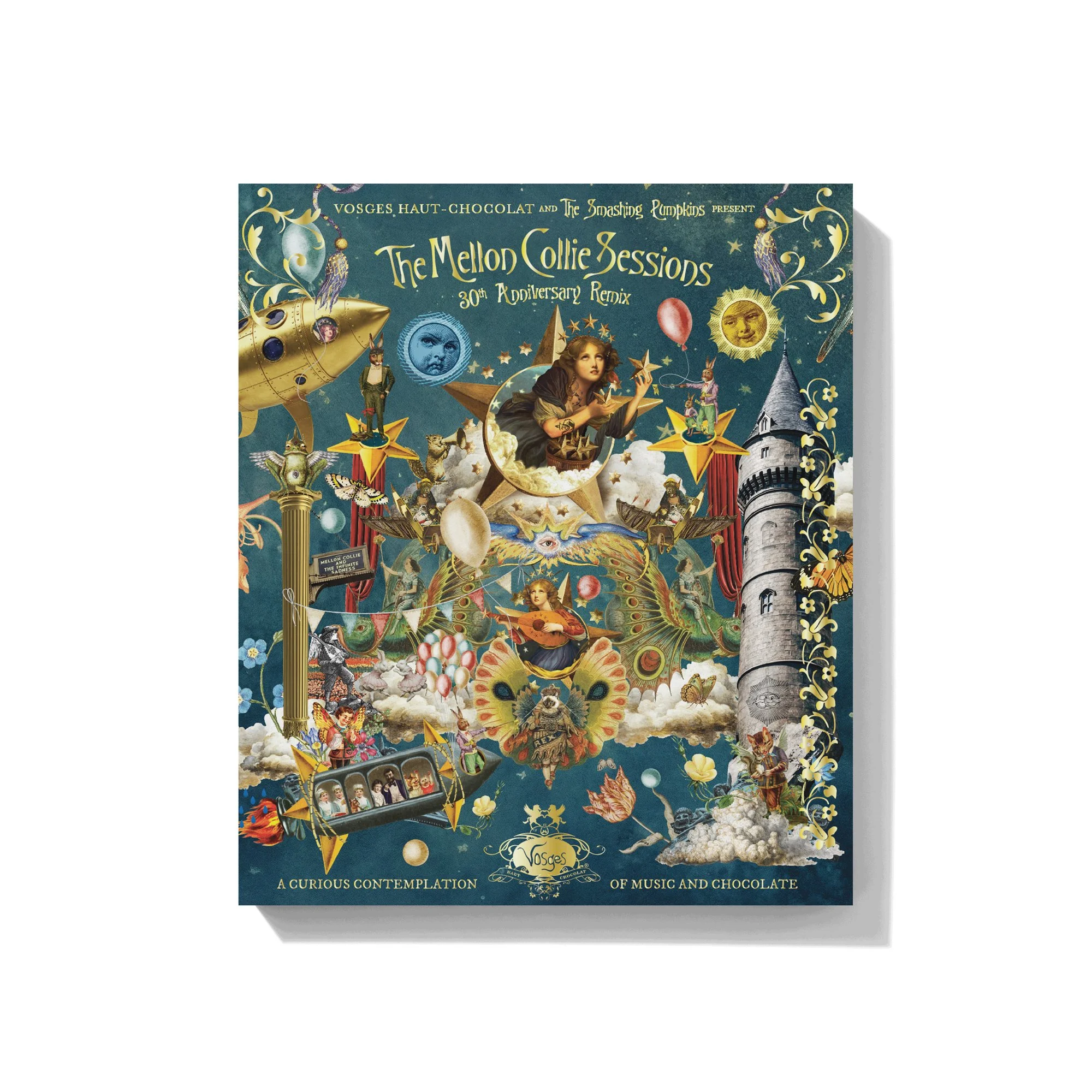
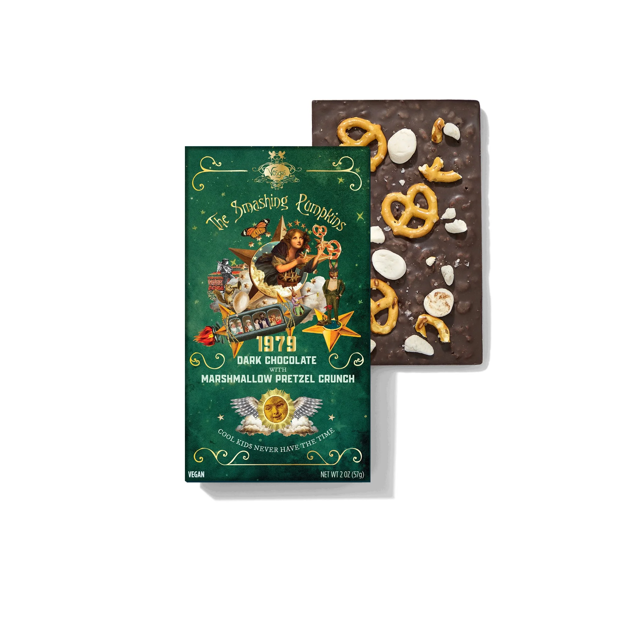
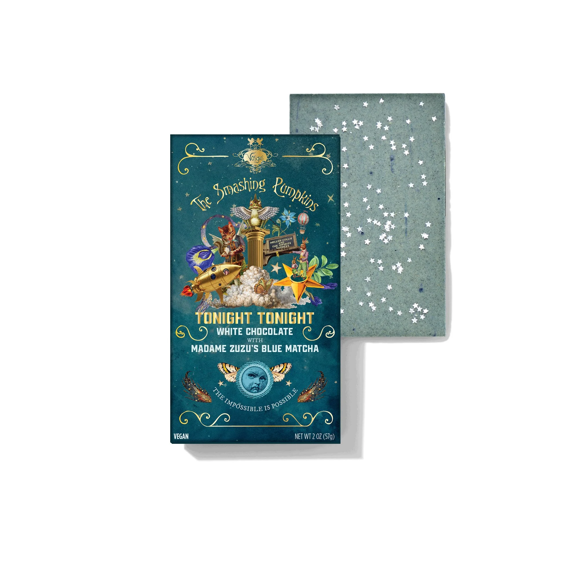
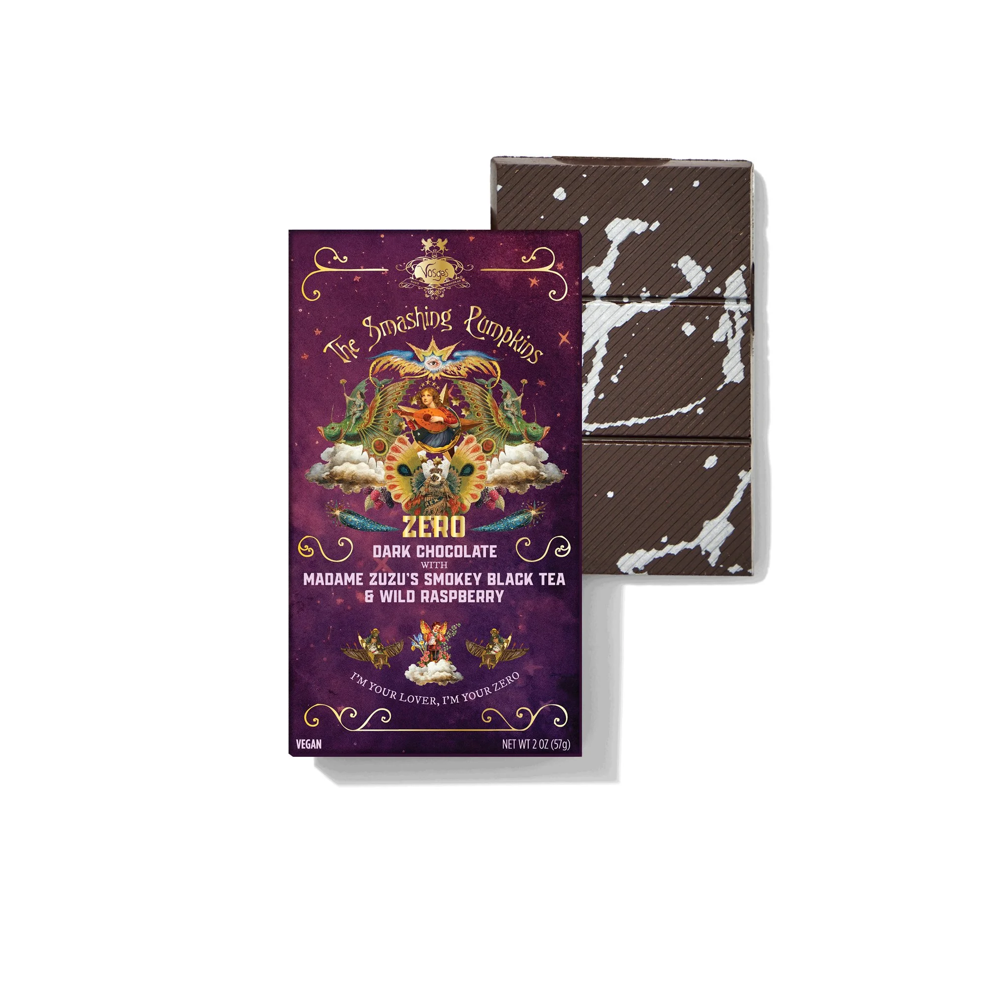
Package design — box set and individual bars, each named after a lyric, flavor matched to the song
Campaign executions — paid social

Paid social — animated campaign executions
Story format executions
Instagram Stories — campaign executions across formats
Paid + organic social — 4:5 animated executions
Full Story

Truly end-to-end. The product itself was conceived from scratch partnering with in-house Chef — recipes developed, bespoke packaging designed and produced, and the full unboxing experience considered at every layer. Then came the storytelling to support it: a campaign built to carry the concept from shelf to screen, with each touchpoint reinforcing the same emotional truth. The kind of work that only happens when creative leads from the very beginning.
For marketing, used the same thought process of creating a world that can come to life in more ways than one — a more conceptual set, and a lifestyle set that felt different enough to be interesting, but unmistakably of the same family. Both were designed to capture wides to convey the idea and collection as a whole, as well as punched-in, delicious-looking product moments.
Full Story