All Work
The brand had the prestige but lacked a consistent visual framework that could guide photography, art direction, and campaign execution across markets.
What I Did
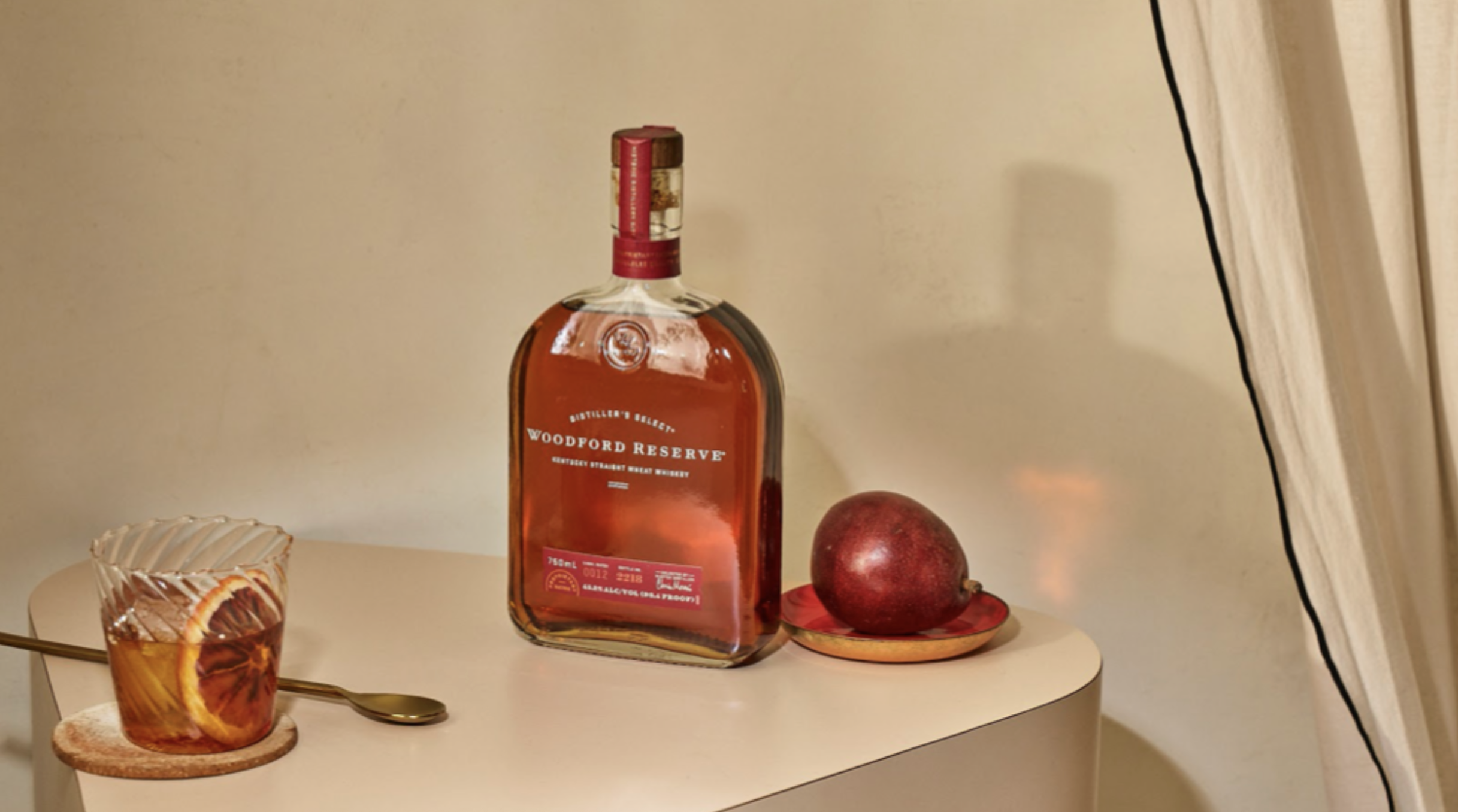
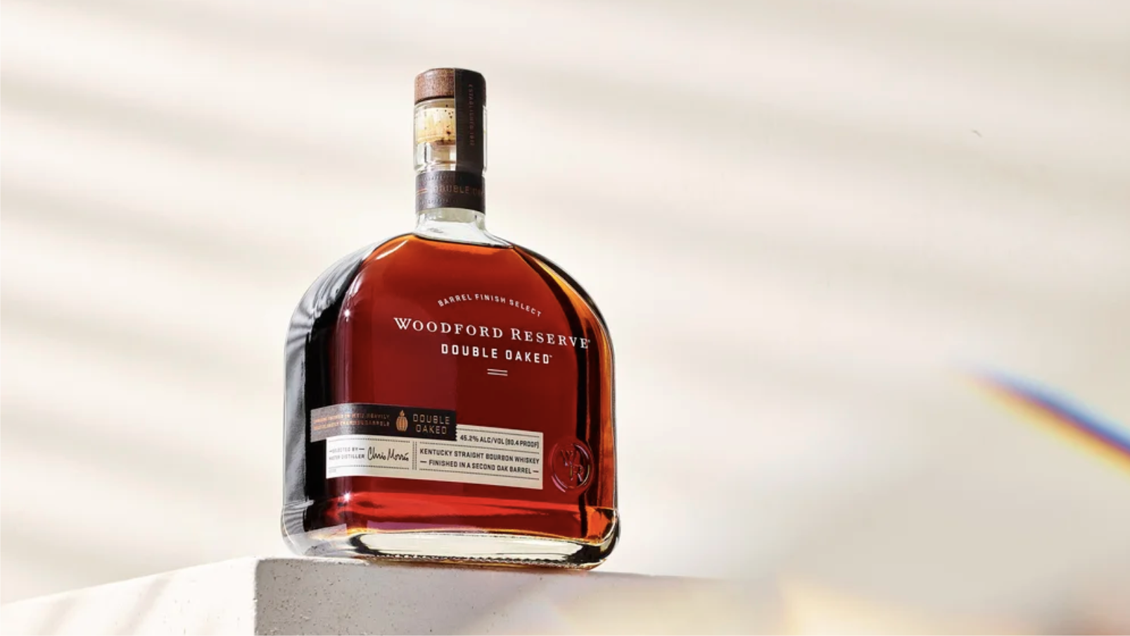
Co-developed the Spectacle for the Senses photography system — a comprehensive visual toolkit that defined how the Woodford Reserve bottle should be photographed: simple, minimal, stylish settings with the bottle as the star. Hard shadows, dramatic reflections, white spectacle world. Built detailed photography guidelines covering lighting, propping, environments, and food styling — all organized so any photographer or market could execute consistently. The system became the visual foundation for all Woodford creative going forward.
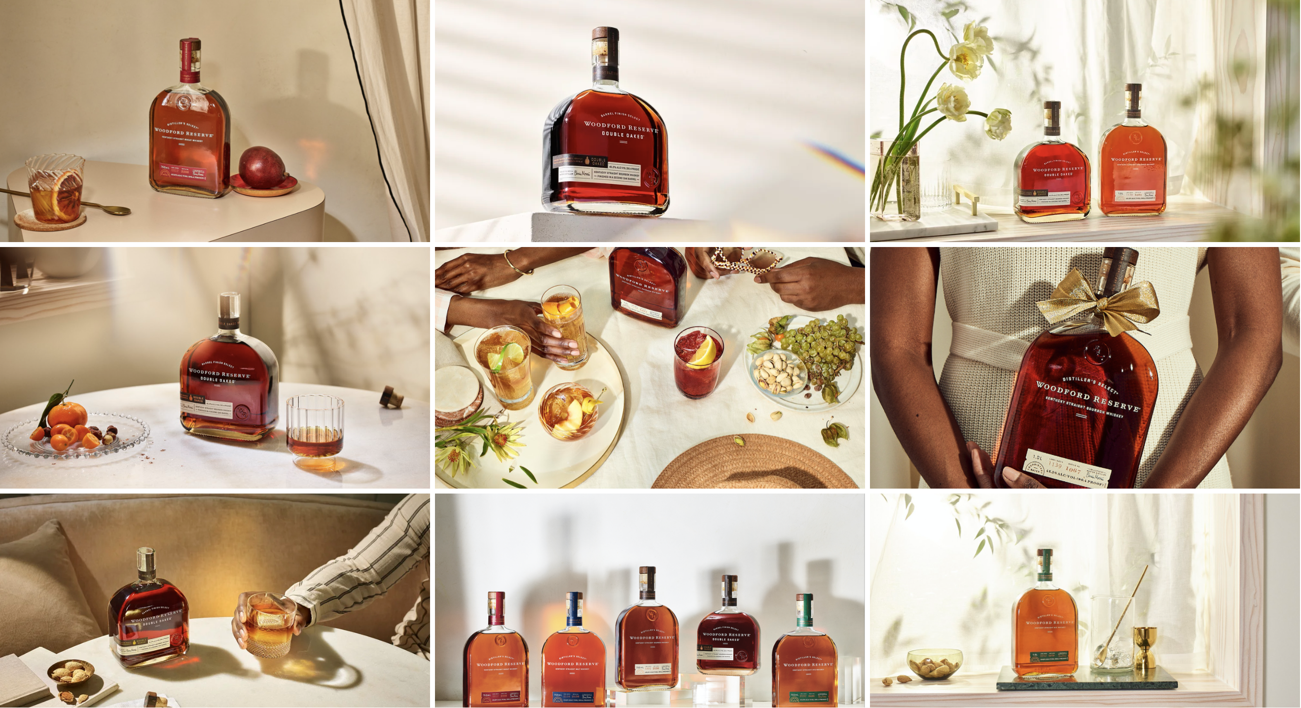
The brief was simple: make the bottle look like the most beautiful thing you've ever seen. The system we built made that repeatable.
The Result
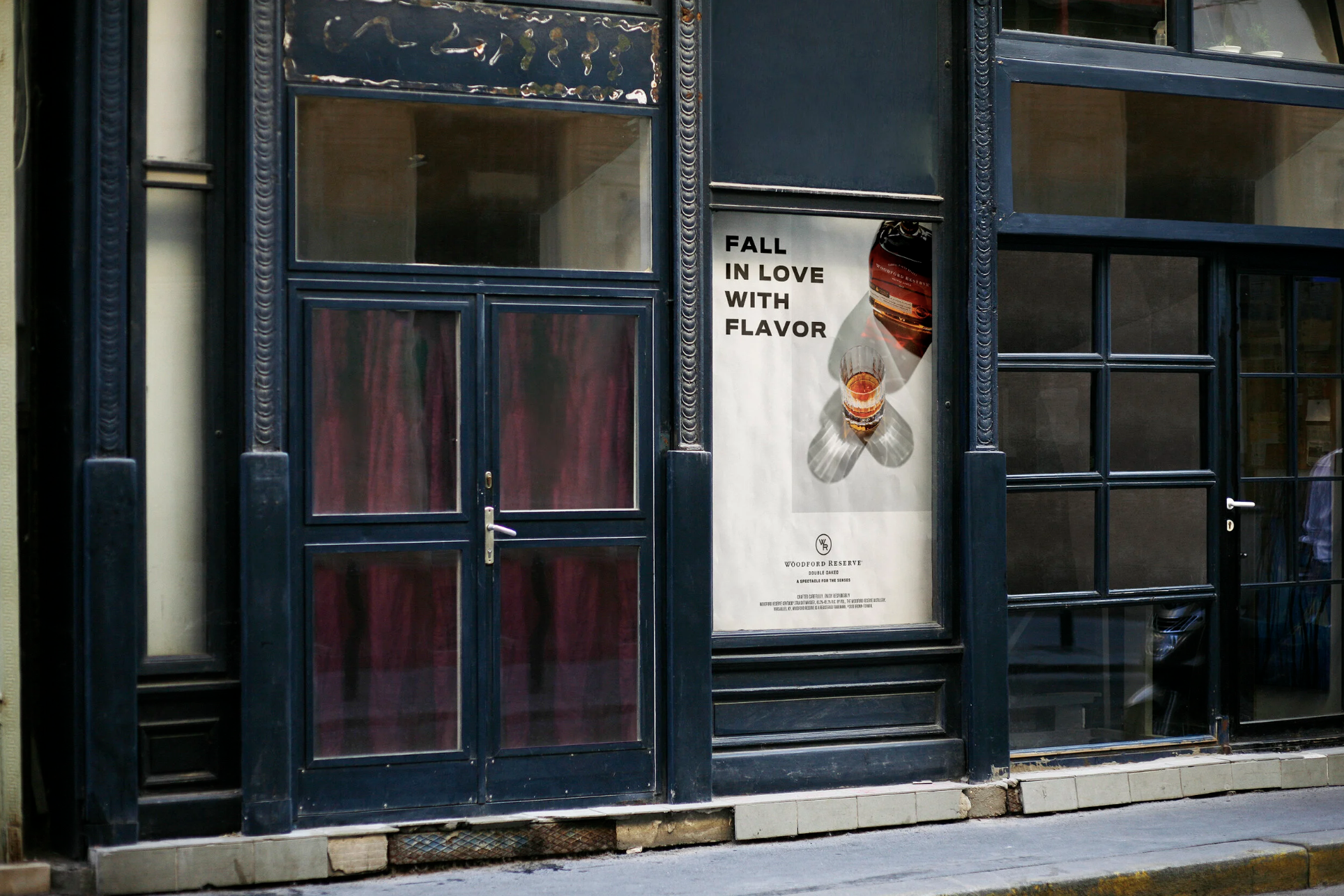
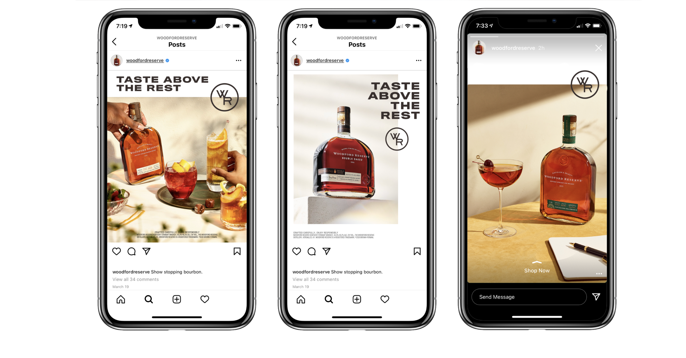
The Woodford Reserve photography guidelines gave the brand a consistent, ownable visual language that could be deployed across markets and media without losing the premium quality the brand demanded.